Astro
Astro components, layouts, and pages
Updated:
Updating the home page
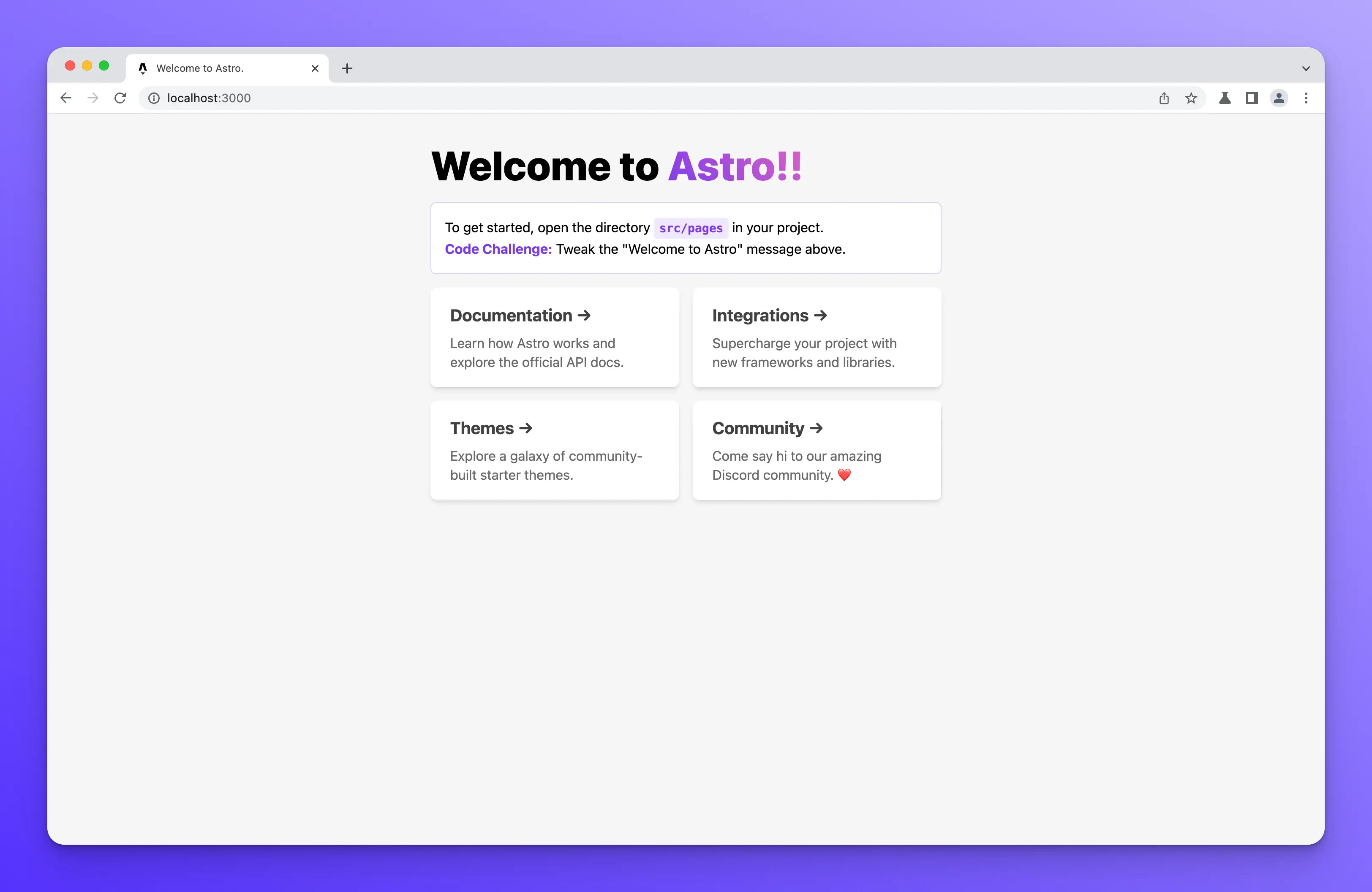
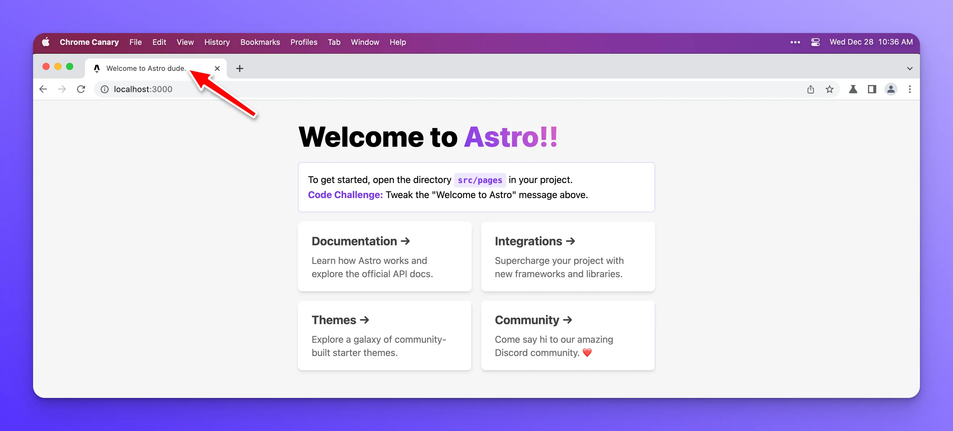
On the homepage of our new Astro site, you will notice a “Code Challenge.” The challenge is to tweak the “Welcome to Astro” message. So, let’s do that.
Open the src/page/index.astro file in VSCode.
Inside the H1 tag is the welcome message we need to update. You can update it to whatever you like, but to keep things simple, I will add a couple of exclamation points to the end of the message.
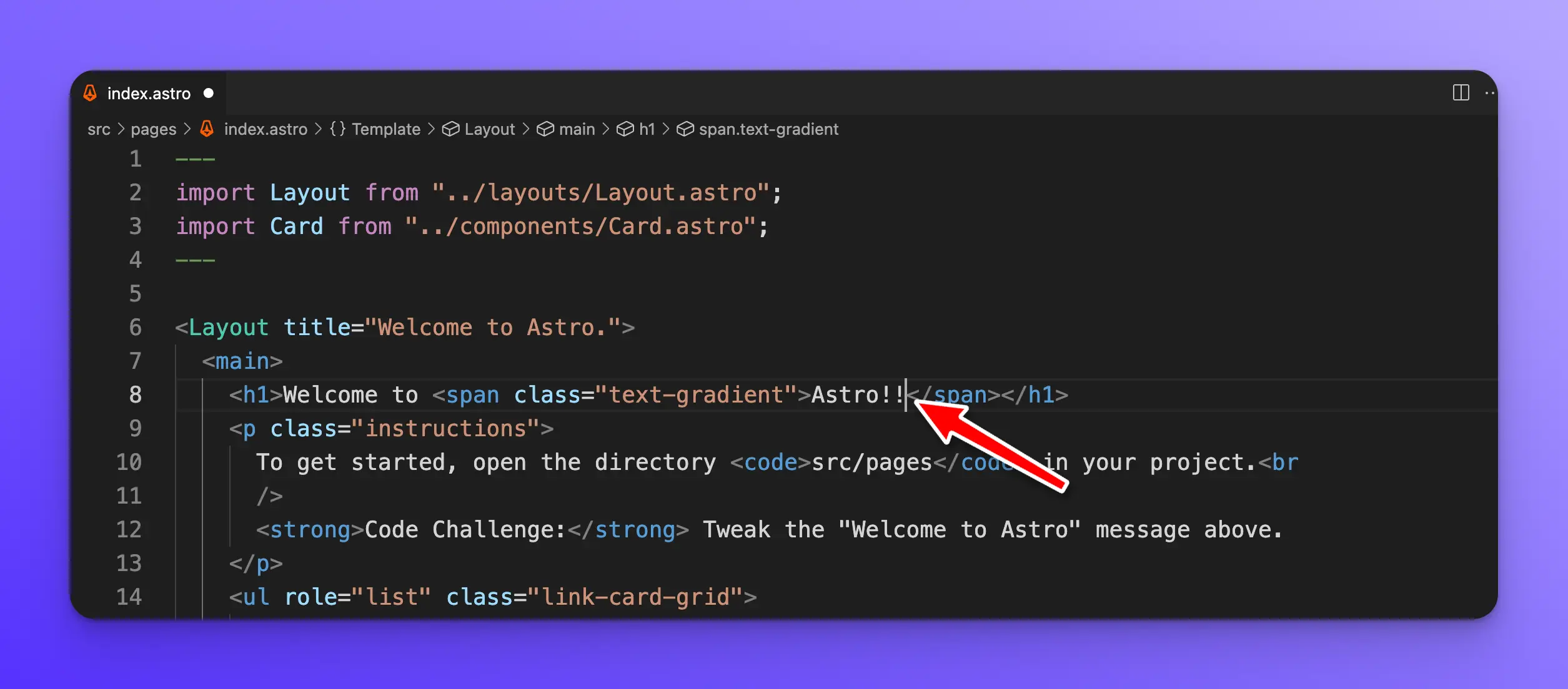
After saving the file, Astro will automatically update the site.
Understanding the Astro component structure
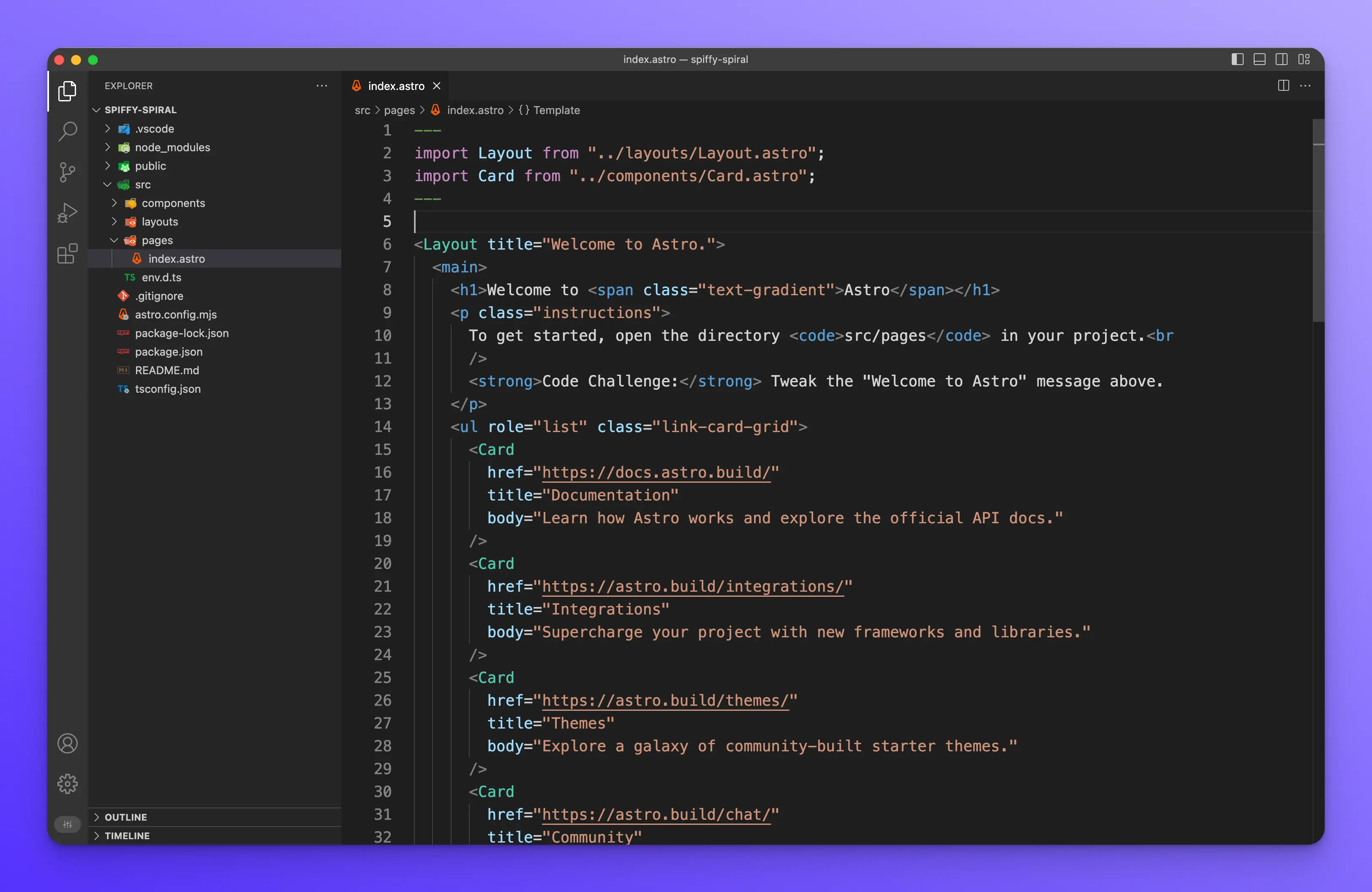
Let’s break down how an Astro component works. For this example, we are still using the file src/pages/index.astro
JavaScript
Whatever JavaScript is necessary for your Astro component or page goes at the top of the file between to --- lines like so:
---
import Layout from "../layouts/Layout.astro";
import Card from "../components/Card.astro";
---
We are importing the layout and card components in this example.
Template
Next, we write our HTML and use our components.
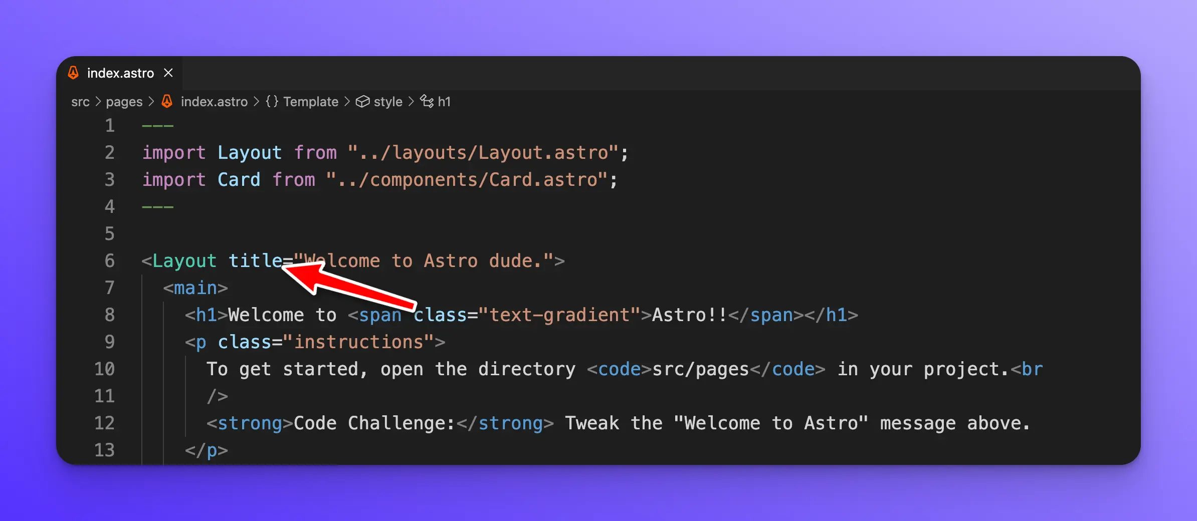
<Layout title="Welcome to Astro.">
	<main>
		<h1>Welcome to <span class="text-gradient">Astro!!</span></h1>
		<p class="instructions">
			To get started, open the directory <code>src/pages</code> in your project.<br
			/>
			<strong>Code Challenge:</strong> Tweak the "Welcome to Astro" message above.
		</p>
		<ul role="list" class="link-card-grid">
			<Card
				href="https://docs.astro.build/"
				title="Documentation"
				body="Learn how Astro works and explore the official API docs."
			/>
			<Card
				href="https://astro.build/integrations/"
				title="Integrations"
				body="Supercharge your project with new frameworks and libraries."
			/>
			<Card
				href="https://astro.build/themes/"
				title="Themes"
				body="Explore a galaxy of community-built starter themes."
			/>
			<Card
				href="https://astro.build/chat/"
				title="Community"
				body="Come say hi to our amazing Discord community. ❤️"
			/>
		</ul>
	</main>
</Layout>
Notice how we have a root Layout component, which we import at the top of the file. Within the ul we are using the Card component, which we are also importing at the top of the file.
You will notice that the Layout component has a title property with the value of “Welcome to Astro.” Update this value and then save the file.
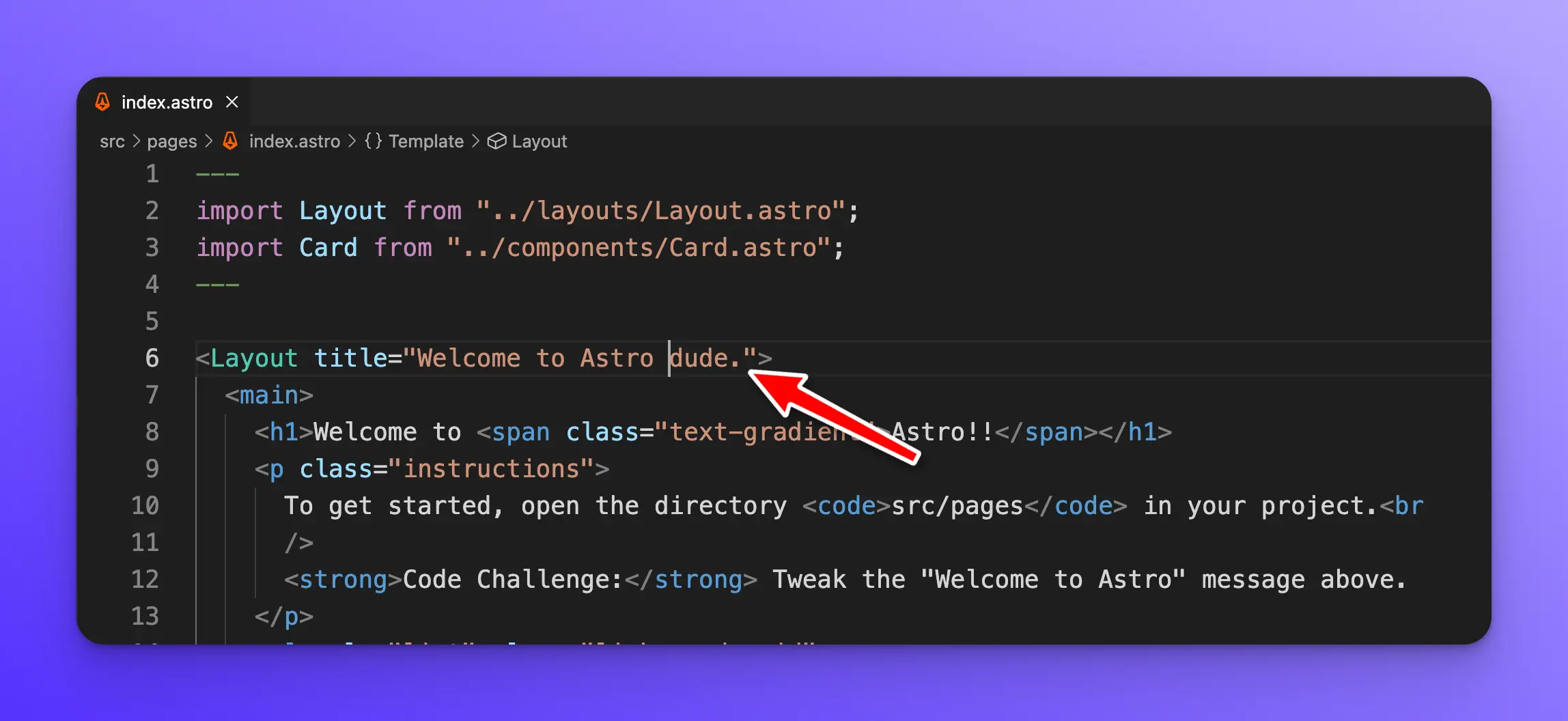
The title property on our Layout component is called a prop. If you have used any modern UI framework like React, Vue, Angular, Svelte, etc. This should be very familiar to you. Props allow you to pass data into your components.
Astro components, in my opinion, are very similar to React and have JSX-like syntax. You will feel right at home if you are already familiar with React.
The Card component has three props, href, title, and body.
Styles
Finally, an Astro component can have styles that are scoped to this component by default by putting whatever CSS is necessary between <style> tags like so:
<style>
  main {
    margin: auto;
    padding: 1.5rem;
    max-width: 60ch;
  }
  h1 {
    font-size: 3rem;
    font-weight: 800;
    margin: 0;
  }
  .text-gradient {
    background-image: var(--accent-gradient);
    -webkit-background-clip: text;
    -webkit-text-fill-color: transparent;
    background-size: 400%;
    background-position: 0%;
  }
  .instructions {
    line-height: 1.6;
    margin: 1rem 0;
    border: 1px solid rgba(var(--accent), 25%);
    background-color: white;
    padding: 1rem;
    border-radius: 0.4rem;
  }
  .instructions code {
    font-size: 0.875em;
    font-weight: bold;
    background: rgba(var(--accent), 12%);
    color: rgb(var(--accent));
    border-radius: 4px;
    padding: 0.3em 0.45em;
  }
  .instructions strong {
    color: rgb(var(--accent));
  }
  .link-card-grid {
    display: grid;
    grid-template-columns: repeat(auto-fit, minmax(24ch, 1fr));
    gap: 1rem;
    padding: 0;
  }
</style>
You should check out the official Astro components documentation to learn more about all the features and functionality.
Astro pages
File-based routing
Astro pages are files that live inside of the src/pages directory. You can think of them as components with extra features like routing, data loading, and page layout. Pages in Astro utilize something called file-based routing. This means that each file in the src/pages directory becomes and endpoint or route in your site.
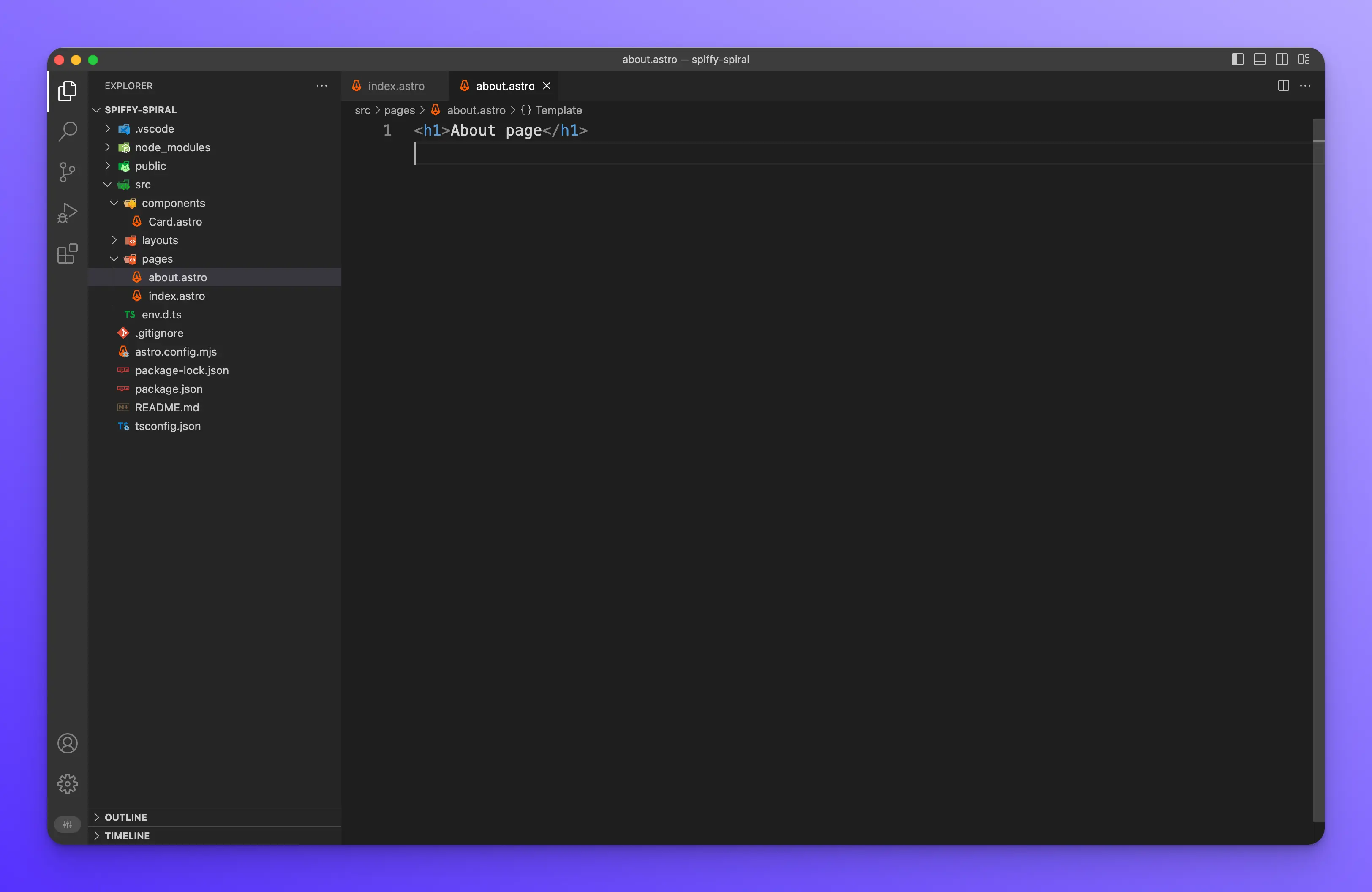
For example, create a new file called src/pages/about.astro and add the following.
Next, in your browser, go to [http://localhost:3000/about](http://localhost:3000/about), and you should see the following.
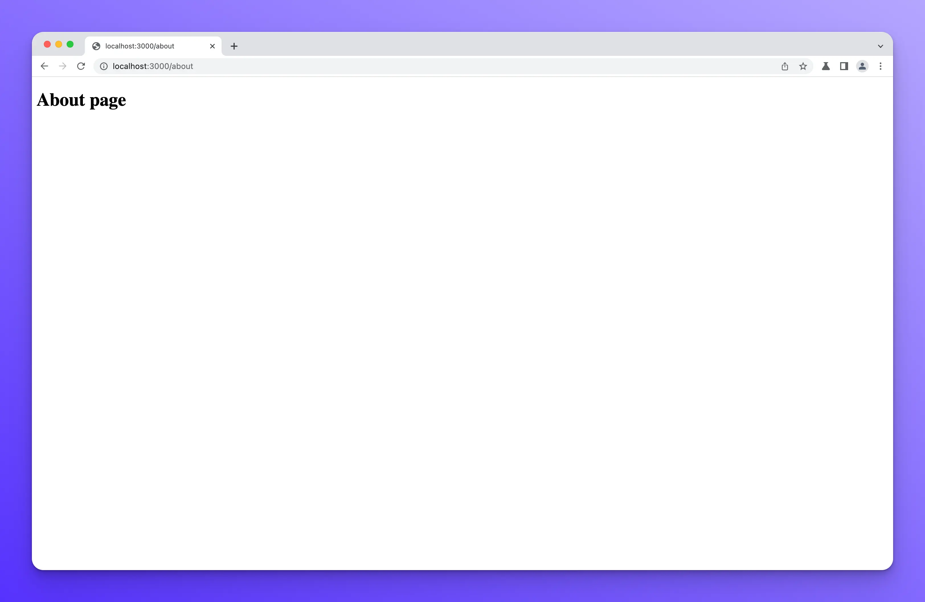
This is how file-based routing works.
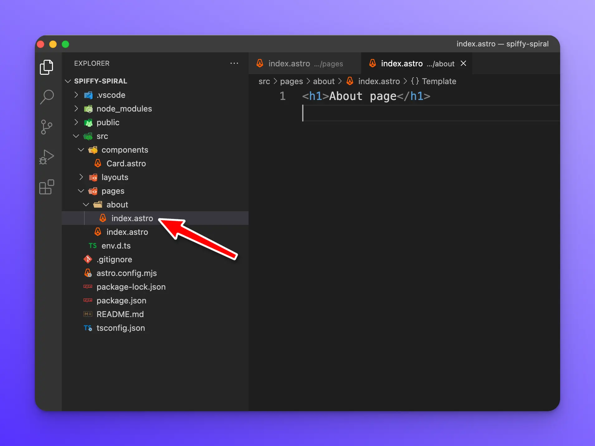
Another way to do this is by creating a new directory called about with an index.astro file inside of it. src/pages/about/index.astro
If you refresh the page you will see the same thing. Using directories allows you to create nested URLs and hierarchies.
MDX and Markdown
Astro also works with [.md and .mdx file extensions](https://docs.astro.build/en/guides/markdown-content/) to generate pages for your site. However, if you wish to use MDX, you must install the MDX Integration.
Astro Layouts
Astro Layouts are special components used to provide reusable UI and templates. Open the file src/layouts/Layout.astro. At the top of the file you should see the following.
---
export interface Props {
	title: string;
}

const { title } = Astro.props;
---
The interface is a TypeScript interface called Props with a title property, which is a string.
Next, we are using JS object destructing to grab the title property off Astro.props. If you remember the src/pages/index.astro file from earlier, this is how we dynamically pass in the title to this Layout component.
const { title } = Astro.props
What this line is doing is grabbing the title prop and making it available as a variable to use throughout the Layout component. Which you can see it in use in the markup just below it.
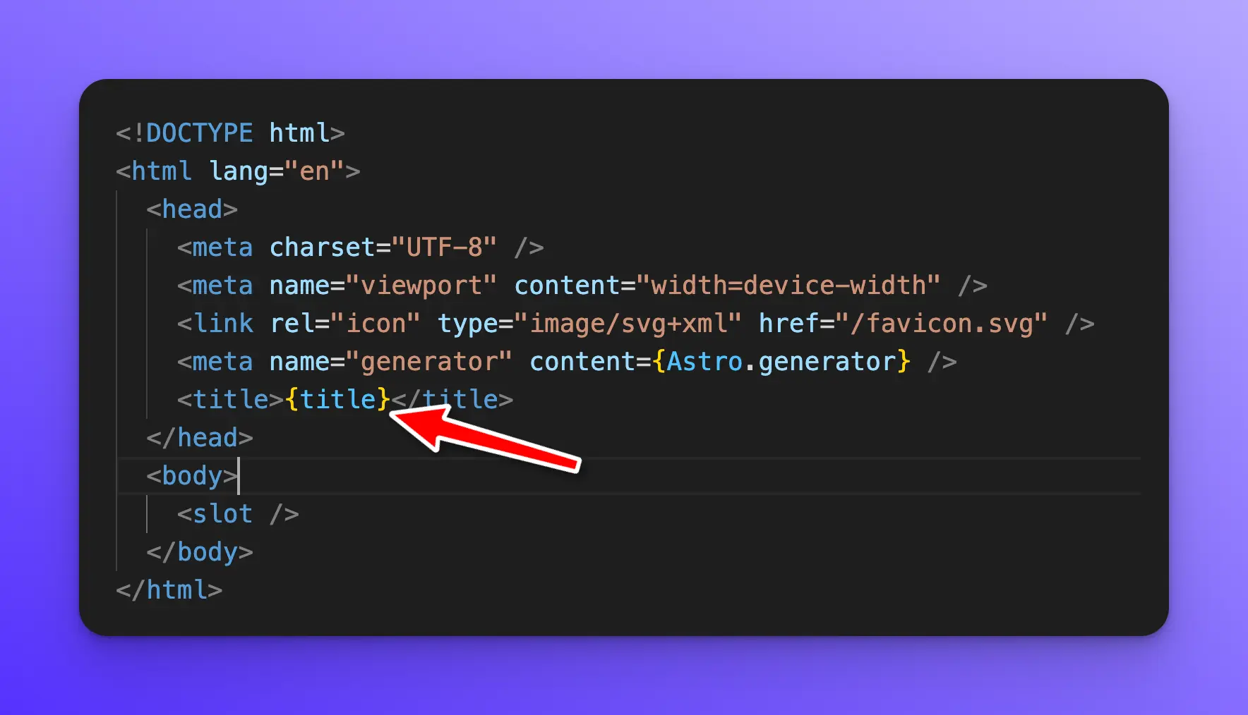
To use variables within your component, wrap them in curly braces {}, just like you would in JSX.
Finally, we have some styles that are scoped to this layout component.
<style is:global>
  :root {
    --accent: 124, 58, 237;
    --accent-gradient: linear-gradient(
      45deg,
      rgb(var(--accent)),
      #da62c4 30%,
      white 60%
    );
  }
  html {
    font-family: system-ui, sans-serif;
    background-color: #f6f6f6;
  }
  code {
    font-family: Menlo, Monaco, Lucida Console, Liberation Mono,
      DejaVu Sans Mono, Bitstream Vera Sans Mono, Courier New, monospace;
  }
</style>
Wrap up
In this lesson, you learned how Astro components, layouts, and pages work.