Tailwind CSS
Tailwind CSS Travel Site - 2. Navigation & Hero
Updated:
In this lesson, we are going to be building the main navigation and hero section.
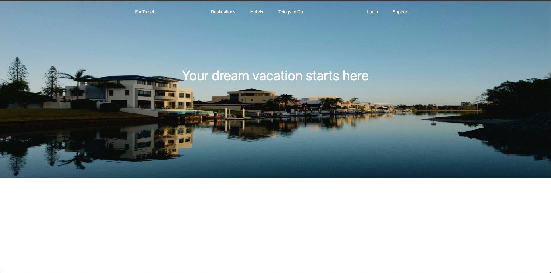
The final result will look like:
You can pick up where we last left off, by cloning the previous tutorial's branch with git.
git clone git@github.com:robertguss/howtocode.io-tailwind-css-landing-page.git

git checkout 1-installing-tailwind-css
The first thing we are going to do is create 2 new partials, one for the nav and the other for the hero. Create 2 new files in the src/partials directory nav.html & hero.html
Now include both of those files inside of src/index.html like so:
<!DOCTYPE html>
<html lang="en">
  <head>
    <meta charset="UTF-8" />
    <meta name="viewport" content="width=device-width, initial-scale=1.0" />
    <title>Home | FunTravel</title>
    <link rel="stylesheet" href="./css/main.css" />
  </head>

  <body>
    <include src="./partials/nav.html"></include>
    <include src="./partials/hero.html"></include>

    <script src="./js/main.js"></script>
  </body>
</html>
Now let's scaffold out some of the navigation boilerplate:
<nav>
  <ul>
    <li>
      <h1>FunTravel</h1>
    </li>

    <li>
      <a>Destinations</a>
      <a>Hotels</a>
      <a>Things to Do</a>
    </li>

    <li>
      <a>Login</a>
      <a>Support</a>
    </li>
  </ul>
</nav>
Our navigation is split into 3 sections, logo, primary & secondary.
When working with something like a navigation this early on in the process, I like to put borders around elements so I can see how large they actually are. Let's put a border around our nav and get it to the correct height and width.
<nav class="border-2 border-red-500 w-full py-6">
  <ul>
    <li>
      <h1>FunTravel</h1>
    </li>

    <li>
      <a>Destinations</a>
      <a>Hotels</a>
      <a>Things to Do</a>
    </li>

    <li>
      <a>Login</a>
      <a>Support</a>
    </li>
  </ul>
</nav>
The nav should like this now: 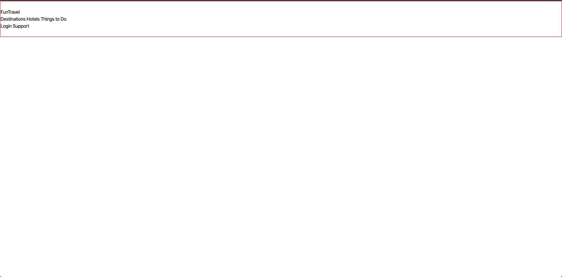
Let's break down these Tailwind CSS classes:
| Class | Value |
|---|---|
| border-2 | border-width: 2px; |
| border-red-500 | border-color: #f56565; |
| w-full | width: 100%; |
| py-6 | padding-top: 1.5rem; padding-bottom: 1.5rem; |
The css would look like this:
nav {
  border: 2px solid #f56565;
  padding-bottom: 1.5rem;
  padding-top: 1.5rem;
  width: 100%;
}
Next, we will style the ul
<nav class="border-2 border-red-500 w-full py-6">
  <ul class="flex items-center justify-around max-w-6xl mx-auto">
    <li>
      <h1>FunTravel</h1>
    </li>

    <li>
      <a>Destinations</a>
      <a>Hotels</a>
      <a>Things to Do</a>
    </li>

    <li>
      <a>Login</a>
      <a>Support</a>
    </li>
  </ul>
</nav>
The nav should like this now: 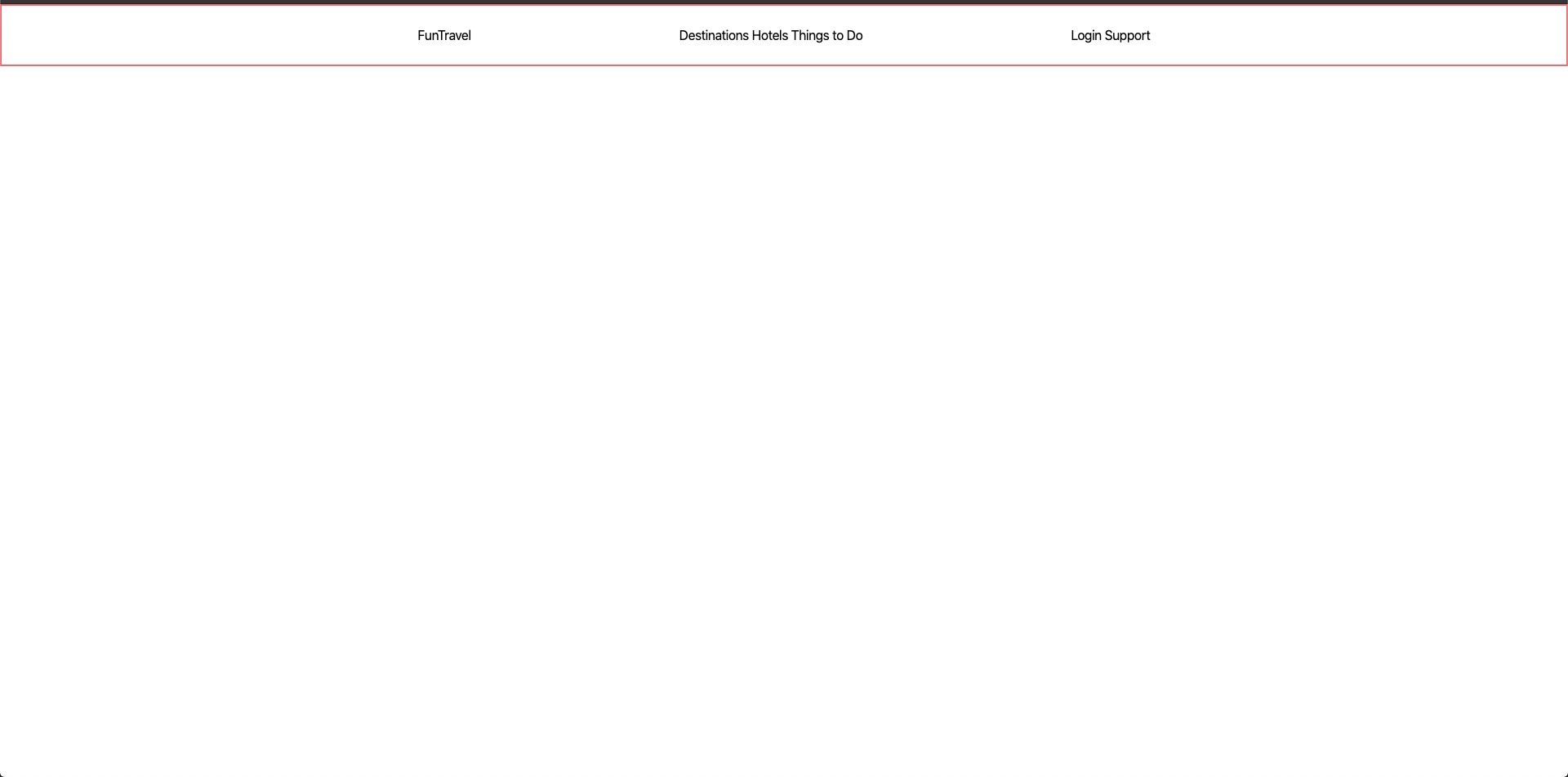
Tailwind CSS classes:
| Class | Value |
|---|---|
| flex | display: flex; |
| items-center | align-items: center; |
| justify-around | justify-content: space-around; |
| max-w-6xl | max-width: 72rem; |
| mx-auto | margin-right: auto; margin-left: auto; |
Finally, we will add some space between the links in the nav.
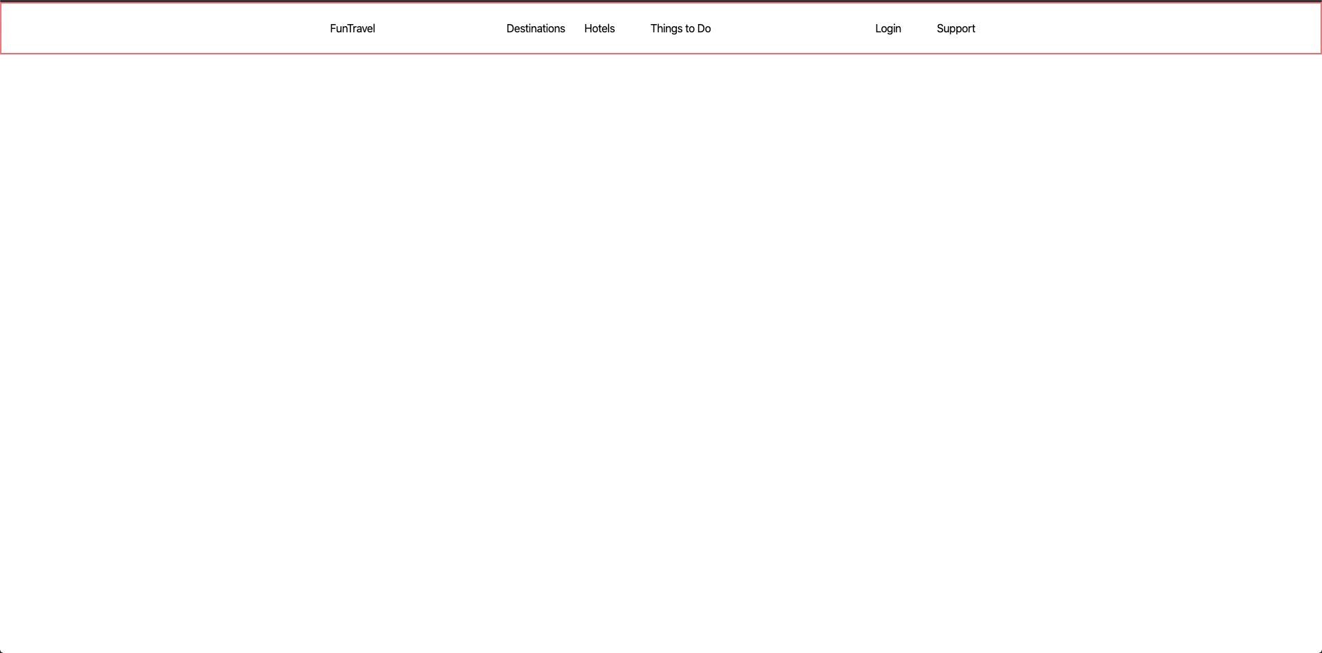
<nav class="border-2 border-red-500 w-full py-6">
  <ul class="flex items-center justify-around max-w-6xl mx-auto">
    <li>
      <h1>FunTravel</h1>
    </li>

    <li>
      <a href="" class="px-6">Destinations</a>
      <a href="" class="px-6">Hotels</a>
      <a href="" class="px-6">Things to Do</a>
    </li>

    <li>
      <a href="" class="px-6">Login</a>
      <a href="" class="px-6">Support</a>
    </li>
  </ul>
</nav>
The nav should like this now:
Tailwind CSS classes:
| Class | Value |
|---|---|
| px-6 | padding-right: 1.5rem; padding-left: 1.5rem; |
Hero
Here is our markup for our hero section:
<section class="hero">
  <img src="./images/hero.jpg" alt="houses on the water" class="w-full" />
  <div
    class="heading-container absolute flex justify-center items-center w-full"
  >
    <h1 class="text-5xl text-white">Your dream vacation starts here</h1>
  </div>
</section>
We have already used several of these classes in our nav. We are, however, using a couple new ones for our headline.
Tailwind CSS classes:
| Class | Value |
|---|---|
| text-5xl | font-size: 3rem; |
| text-white | color: #fff; |
We need to write a little bit of css for the hero's height. Add the following inside of src/css/main.css
@tailwind base;
@tailwind components;
@tailwind utilities;

.hero img {
  height: 65vh;
}

.heading-container {
  height: 65vh;
  top: -50px;
}
The nav and hero should now look like: 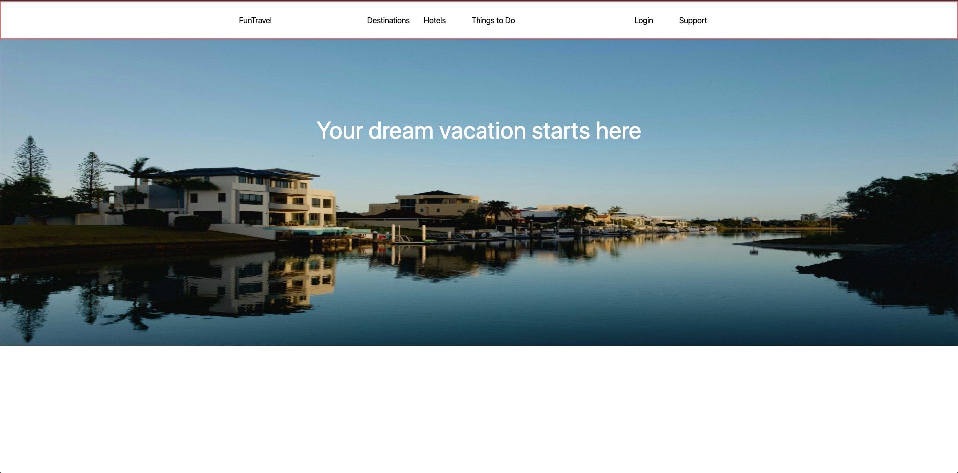
For the final step, we need to position the hero behind the nav and change the nav links to white.
Update the nav.html partial to the following:
<nav class="absolute w-full py-6">
  <ul class="flex items-center justify-around max-w-6xl mx-auto">
    <li>
      <h1 class="text-white">FunTravel</h1>
    </li>

    <li>
      <a href="" class="text-white px-6">Destinations</a>
      <a href="" class="text-white px-6">Hotels</a>
      <a href="" class="text-white px-6">Things to Do</a>
    </li>

    <li>
      <a href="" class="text-white px-6">Login</a>
      <a href="" class="text-white px-6">Support</a>
    </li>
  </ul>
</nav>
The nav and hero should now look like:
That's it! Now that we have our nav and hero finished, we can move onto the next section. 😎
You can download a copy of the completed tutorial from the repo here. Each section of the tutorial is within its own branch. The branch for this article is 2-nav-and-hero
Or you can do it via git with:
git clone git@github.com:robertguss/howtocode.io-tailwind-css-landing-page.git
git checkout 2-nav-and-hero