Tailwind CSS
Tailwind CSS Travel Site - 6. Callouts Section
Updated:
In this lesson, we are going to be building the callouts section of our travel site.
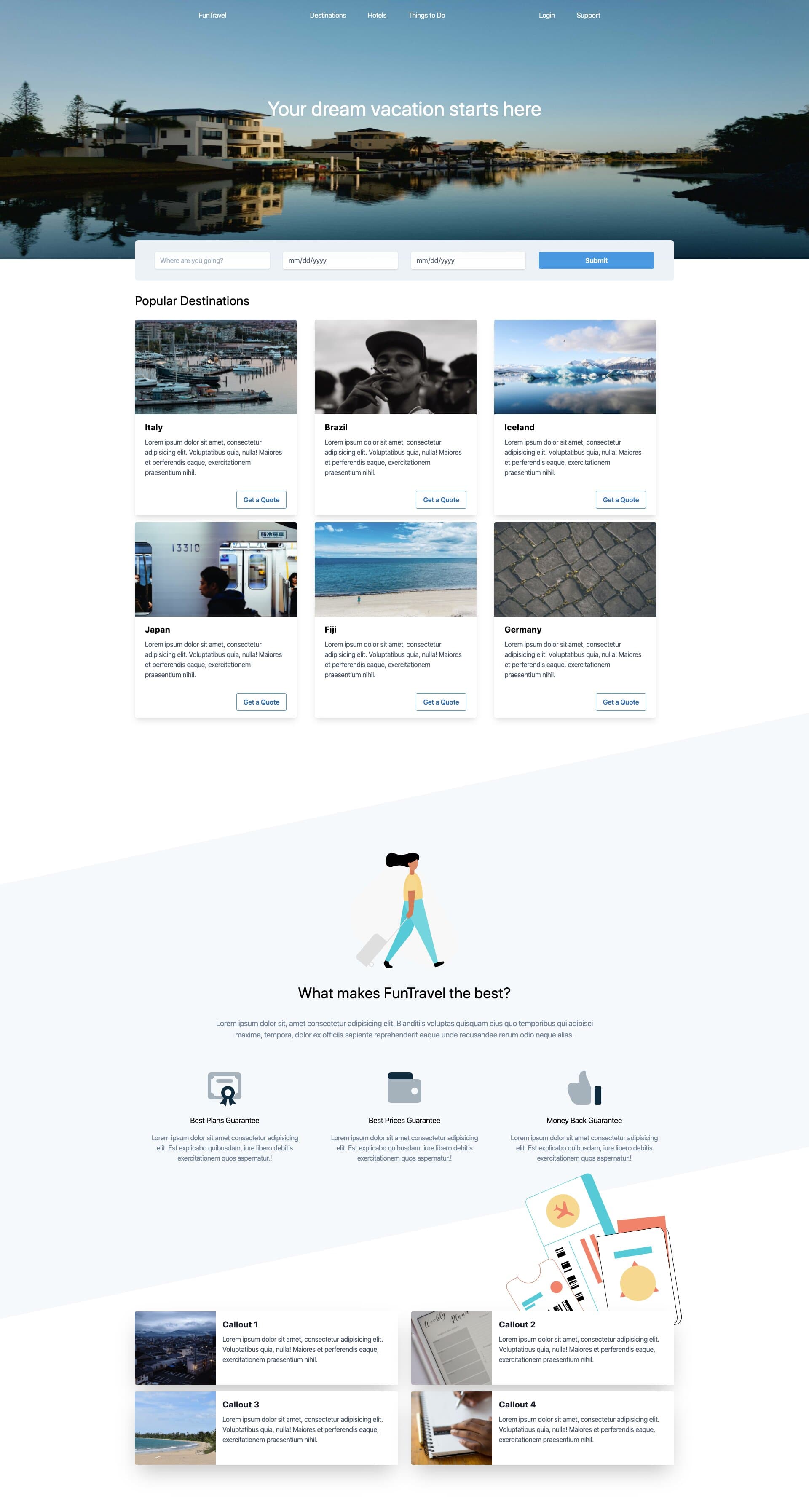
The final result will look like:
You can pick up where we last left off, by cloning the previous tutorial's branch with git.
git clone git@github.com:robertguss/howtocode.io-tailwind-css-landing-page.git

git checkout 5-features-section
First, let's create a new partial called callouts.html and include it in our src/partials directory and then include it in our index.html
<!DOCTYPE html>
<html lang="en">
  <head>
    <meta charset="UTF-8" />
    <meta name="viewport" content="width=device-width, initial-scale=1.0" />
    <title>Home | FunTravel</title>
    <link rel="stylesheet" href="./css/main.css" />
  </head>

  <body>
    <include src="./partials/nav.html"></include>
    <include src="./partials/hero.html"></include>
    <include src="./partials/quote-form.html"></include>
    <include src="./partials/popular-destinations.html"></include>
    <include src="./partials/features.html"></include>
    <include src="./partials/callouts.html"></include>

    <script src="./js/main.js"></script>
  </body>
</html>
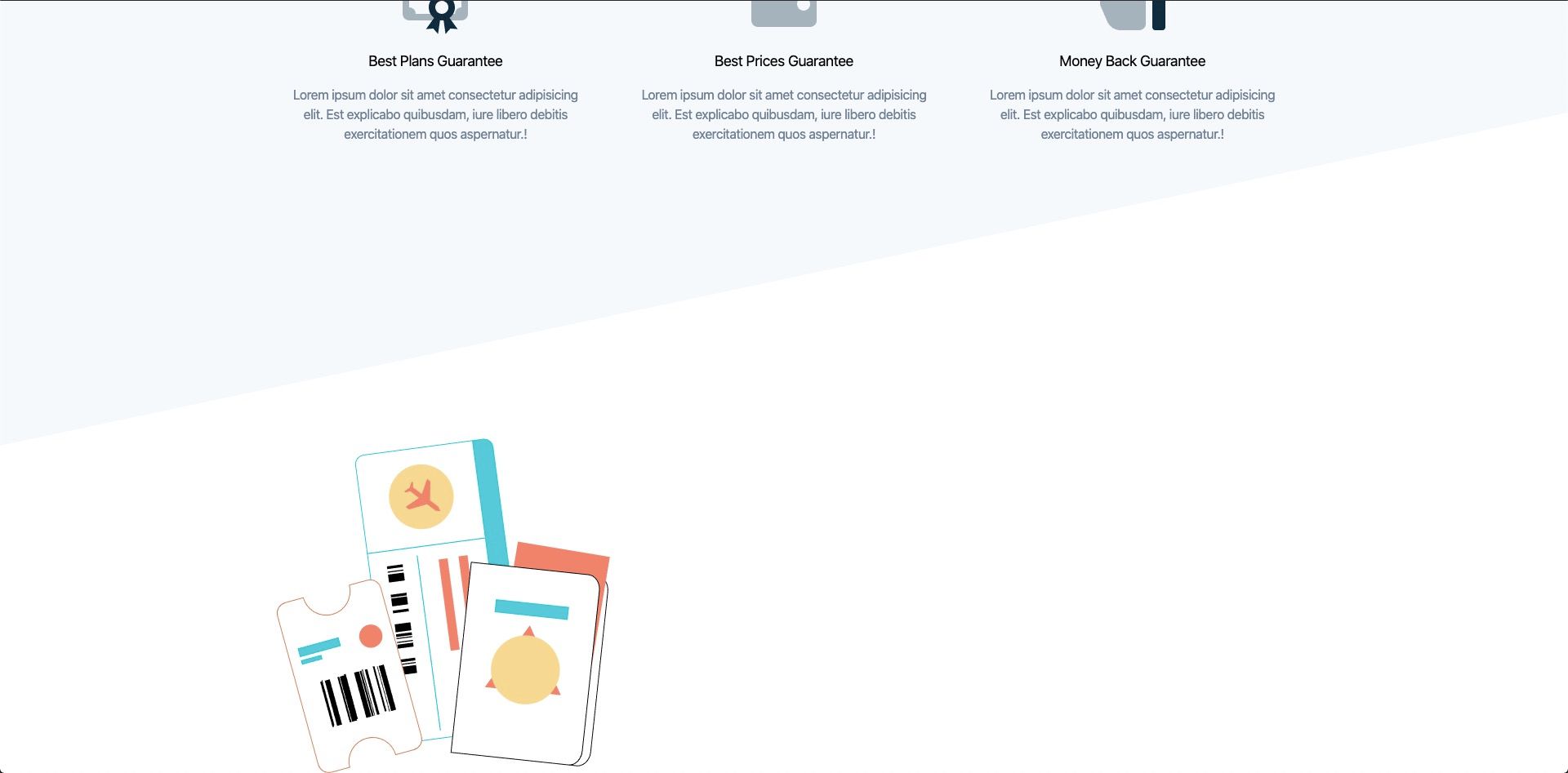
Then we will add our travel tickets illustration.
<section class="plan-types relative container mx-auto mt-48 pb-24">
  <!-- Travel Tickets Illustration -->
  <div class="travel-tickets-illustration pt-32">
    <img
      class="travel-tickets w-1/3 absolute"
      src="./images/travel-tickets-colour.svg"
      alt=""
    />
  </div>
</section>
It should look like this.
Next, let's add our first callout
<section class="plan-types relative container mx-auto mt-48 pb-24">
  <!-- Travel Tickets Illustration -->
  <div class="travel-tickets-illustration pt-32">
    <img
      class="travel-tickets w-1/3 absolute"
      src="./images/travel-tickets-colour.svg"
      alt=""
    />
  </div>

  <!-- Callout 1 -->
  <div class="w-full mx-auto lg:max-w-full lg:flex shadow-2xl">
    <div
      class="plan-image h-48 lg:h-auto lg:w-48 flex-none bg-cover rounded-t lg:rounded-t-none lg:rounded-l text-center overflow-hidden bg-center"
      style="background-image: url(https://source.unsplash.com/600x400/?nature)"
    ></div>
    <div
      class="bg-white rounded-b lg:rounded-b-none lg:rounded-r p-4 flex flex-col justify-between leading-normal"
    >
      <div class="mb-8">
        <div class="text-gray-900 font-bold text-xl mb-2">Callout 1</div>
        <p class="text-gray-700 text-base">
          Lorem ipsum dolor sit amet, consectetur adipisicing elit. Voluptatibus
          quia, nulla! Maiores et perferendis eaque, exercitationem praesentium
          nihil.
        </p>
      </div>
    </div>
  </div>
</section>
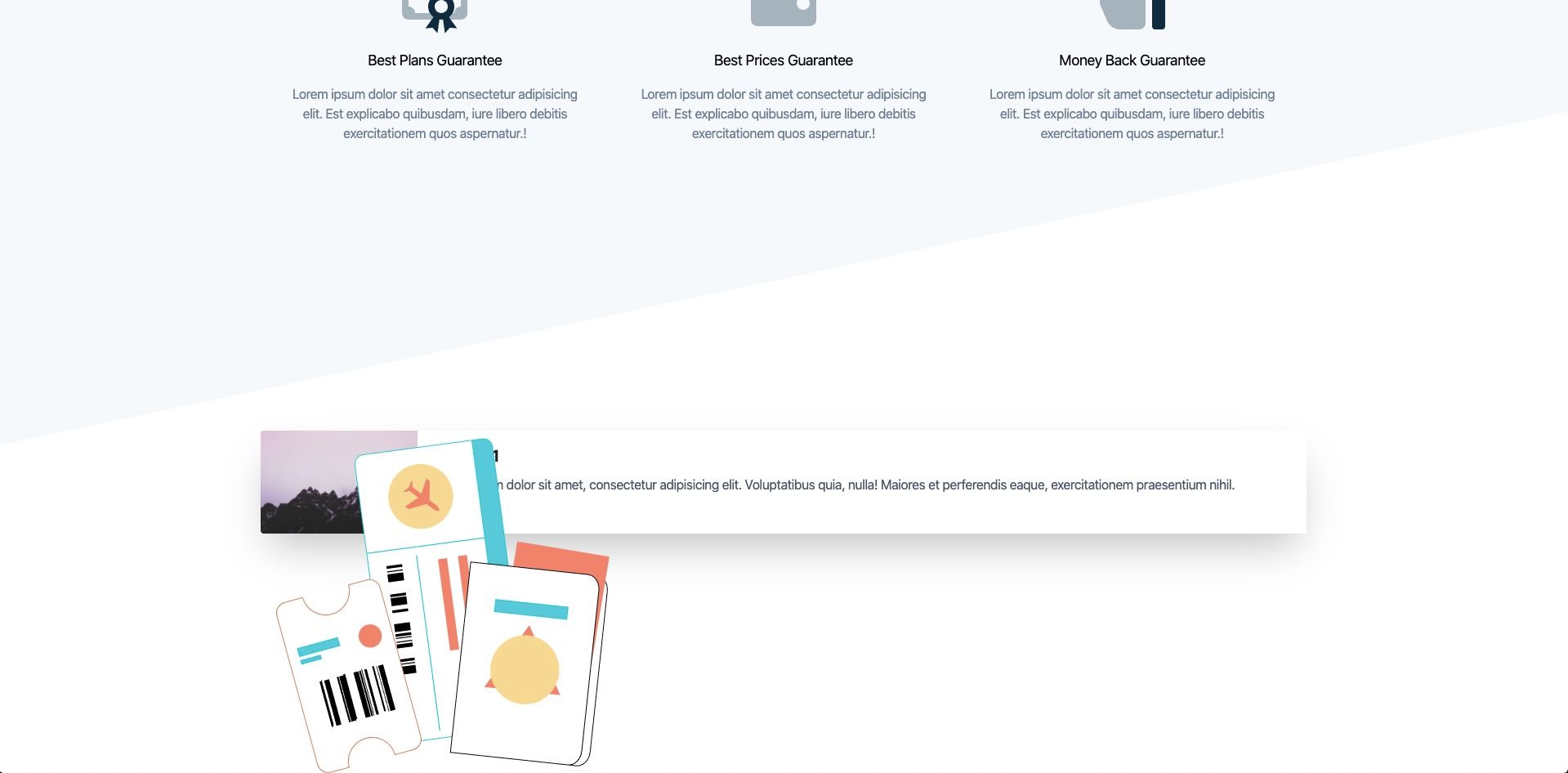
Now if you look at our page, our tickets are overlapping our card.
Let's add some custom css to position these tickets in a better spot. Add the following to main.css
.travel-tickets {
  right: 0;
  top: -200px;
  transform: rotate(-15deg);
  z-index: -1;
}
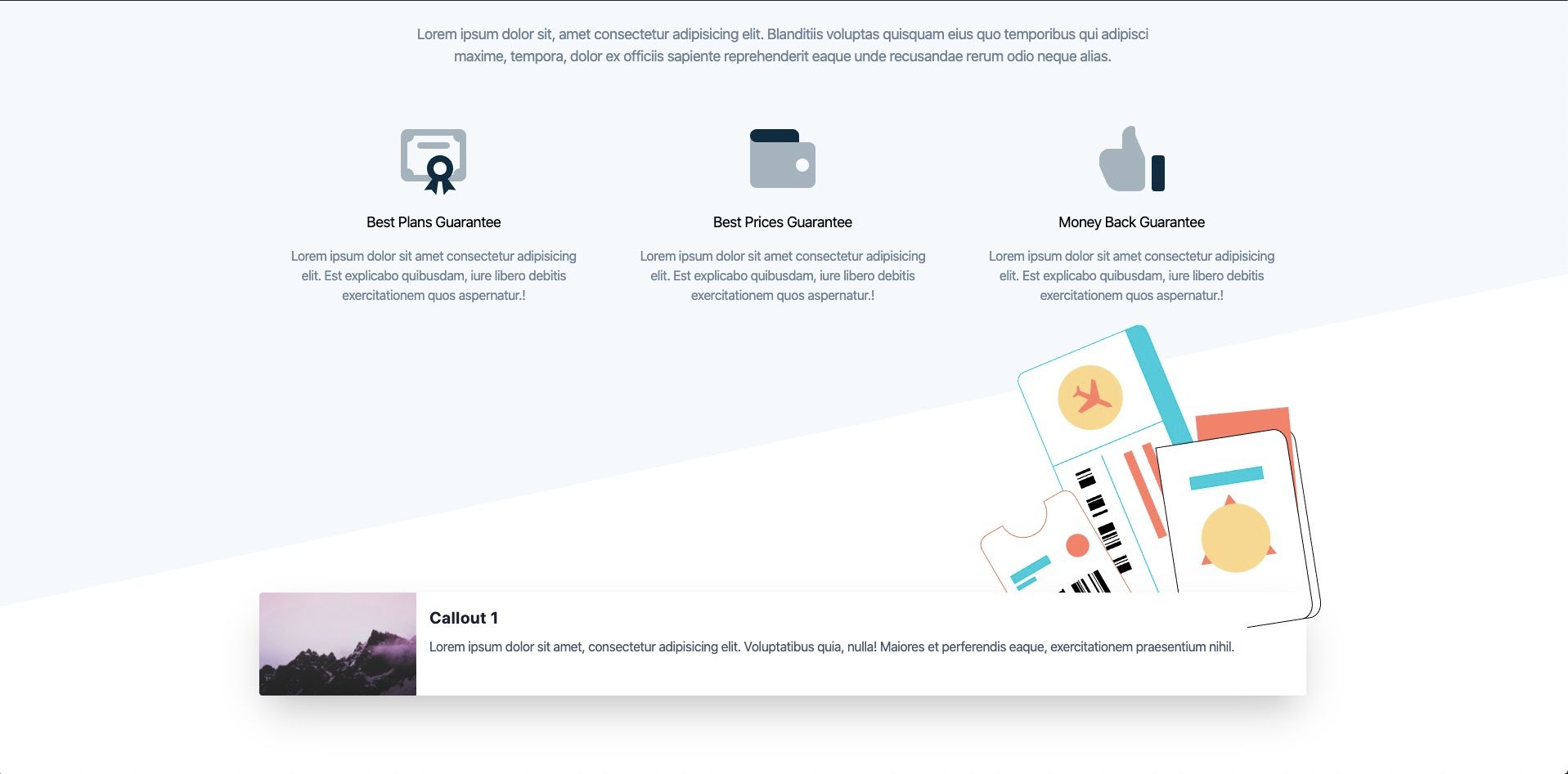
Much better 😎
Now we will add another callout before we put it inside of a 2 column grid
Here is the markup before we add the grid
<section class="plan-types relative container mx-auto mt-48 pb-24">
  <!-- Travel Tickets Illustration -->
  <div class="travel-tickets-illustration pt-32">
    <img
      class="travel-tickets w-1/3 absolute"
      src="./images/travel-tickets-colour.svg"
      alt=""
    />
  </div>

  <!-- Callout 1 -->
  <div class="w-full mx-auto lg:max-w-full lg:flex shadow-2xl">
    <div
      class="plan-image h-48 lg:h-auto lg:w-48 flex-none bg-cover rounded-t lg:rounded-t-none lg:rounded-l text-center overflow-hidden bg-center"
      style="background-image: url(https://source.unsplash.com/600x400/?nature)"
    ></div>
    <div
      class="bg-white rounded-b lg:rounded-b-none lg:rounded-r p-4 flex flex-col justify-between leading-normal"
    >
      <div class="mb-8">
        <div class="text-gray-900 font-bold text-xl mb-2">Callout 1</div>
        <p class="text-gray-700 text-base">
          Lorem ipsum dolor sit amet, consectetur adipisicing elit. Voluptatibus
          quia, nulla! Maiores et perferendis eaque, exercitationem praesentium
          nihil.
        </p>
      </div>
    </div>
  </div>

  <!-- Callout 2 -->
  <div class="w-full mx-auto lg:max-w-full lg:flex shadow-2xl">
    <div
      class="plan-image h-48 lg:h-auto lg:w-48 flex-none bg-cover rounded-t lg:rounded-t-none lg:rounded-l text-center overflow-hidden bg-center"
      style="background-image: url(https://source.unsplash.com/600x400/?business)"
    ></div>
    <div
      class="bg-white rounded-b lg:rounded-b-none lg:rounded-r p-4 flex flex-col justify-between leading-normal"
    >
      <div class="mb-8">
        <div class="text-gray-900 font-bold text-xl mb-2">Callout 2</div>
        <p class="text-gray-700 text-base">
          Lorem ipsum dolor sit amet, consectetur adipisicing elit. Voluptatibus
          quia, nulla! Maiores et perferendis eaque, exercitationem praesentium
          nihil.
        </p>
      </div>
    </div>
  </div>
</section>
Here is the markup with the 2 column grid
<section class="plan-types relative container mx-auto mt-48 pb-24">
  <!-- Travel Tickets Illustration -->
  <div class="travel-tickets-illustration pt-32">
    <img
      class="travel-tickets w-1/3 absolute"
      src="./images/travel-tickets-colour.svg"
      alt=""
    />
  </div>

  <!-- Row #1 -->
  <div class="flex mb-4">
    <div class="w-1/2 mr-8">
      <!-- Callout 1 -->
      <div class="w-full mx-auto lg:max-w-full lg:flex shadow-2xl">
        <div
          class="plan-image h-48 lg:h-auto lg:w-48 flex-none bg-cover rounded-t lg:rounded-t-none lg:rounded-l text-center overflow-hidden bg-center"
          style="background-image: url(https://source.unsplash.com/600x400/?nature)"
        ></div>
        <div
          class="bg-white rounded-b lg:rounded-b-none lg:rounded-r p-4 flex flex-col justify-between leading-normal"
        >
          <div class="mb-8">
            <div class="text-gray-900 font-bold text-xl mb-2">Callout 1</div>
            <p class="text-gray-700 text-base">
              Lorem ipsum dolor sit amet, consectetur adipisicing elit.
              Voluptatibus quia, nulla! Maiores et perferendis eaque,
              exercitationem praesentium nihil.
            </p>
          </div>
        </div>
      </div>
    </div>

    <div class="w-1/2">
      <!-- Callout 2 -->
      <div class="w-full mx-auto lg:max-w-full lg:flex shadow-2xl">
        <div
          class="plan-image h-48 lg:h-auto lg:w-48 flex-none bg-cover rounded-t lg:rounded-t-none lg:rounded-l text-center overflow-hidden bg-center"
          style="background-image: url(https://source.unsplash.com/600x400/?business)"
        ></div>
        <div
          class="bg-white rounded-b lg:rounded-b-none lg:rounded-r p-4 flex flex-col justify-between leading-normal"
        >
          <div class="mb-8">
            <div class="text-gray-900 font-bold text-xl mb-2">Callout 2</div>
            <p class="text-gray-700 text-base">
              Lorem ipsum dolor sit amet, consectetur adipisicing elit.
              Voluptatibus quia, nulla! Maiores et perferendis eaque,
              exercitationem praesentium nihil.
            </p>
          </div>
        </div>
      </div>
    </div>
  </div>
</section>
Here is what our callouts now look like.
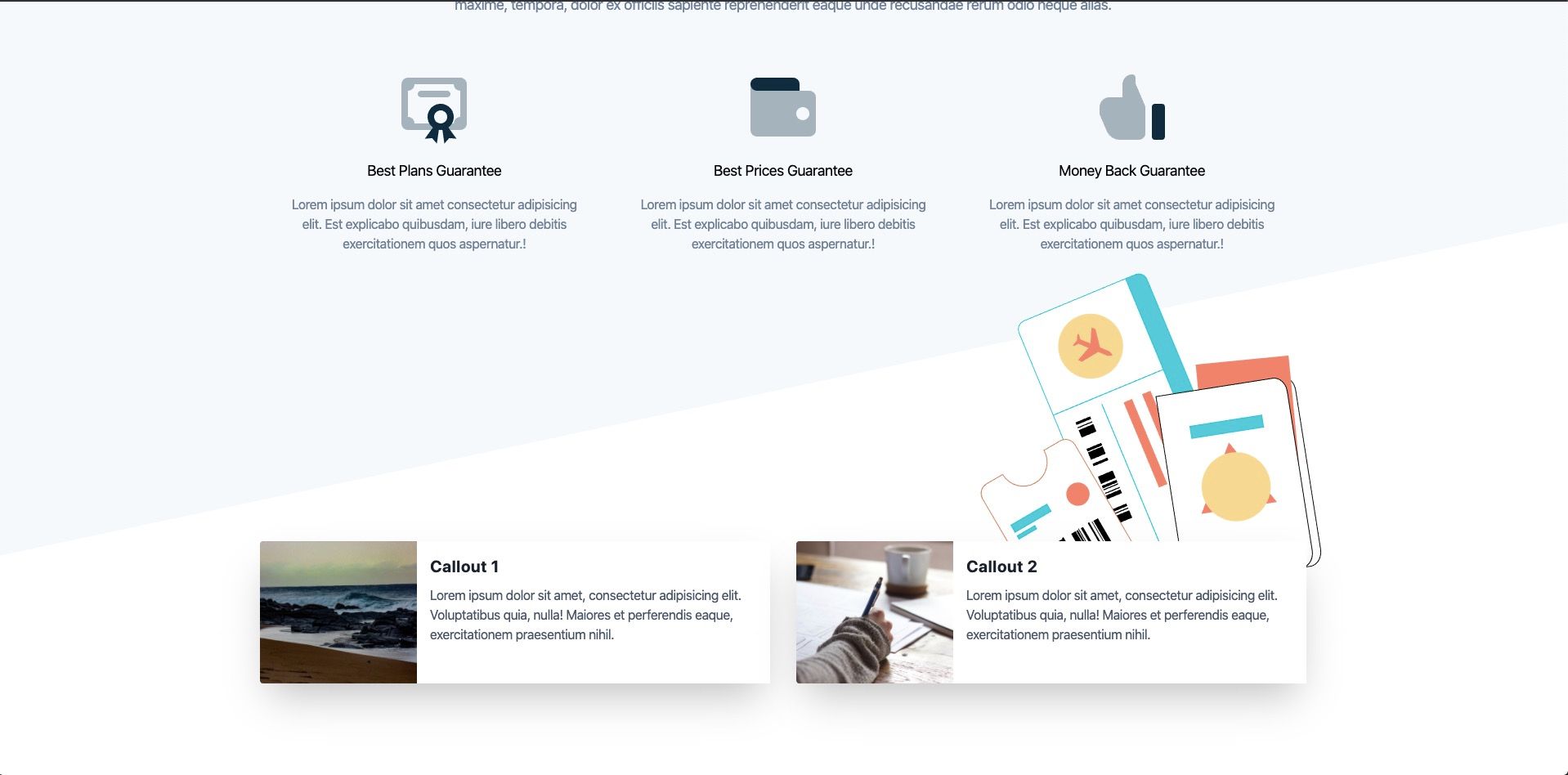
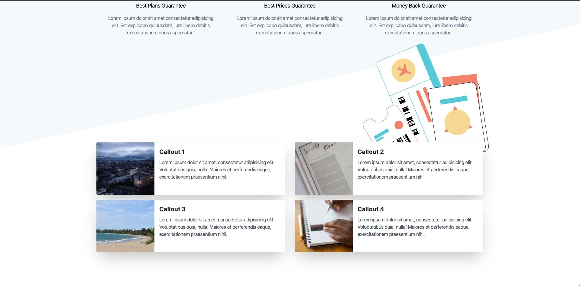
Now all we have to do is duplicate our 2 callouts and the grid and change the images and titles.
<section class="plan-types relative container mx-auto mt-48 pb-24">
  <!-- Travel Tickets Illustration -->
  <div class="travel-tickets-illustration pt-32">
    <img
      class="travel-tickets w-1/3 absolute"
      src="./images/travel-tickets-colour.svg"
      alt=""
    />
  </div>

  <!-- Row #1 -->
  <div class="flex mb-4">
    <div class="w-1/2 mr-8">
      <!-- Callout 1 -->
      <div class="w-full mx-auto lg:max-w-full lg:flex shadow-2xl">
        <div
          class="plan-image h-48 lg:h-auto lg:w-48 flex-none bg-cover rounded-t lg:rounded-t-none lg:rounded-l text-center overflow-hidden bg-center"
          style="background-image: url(https://source.unsplash.com/600x400/?nature)"
        ></div>
        <div
          class="bg-white rounded-b lg:rounded-b-none lg:rounded-r p-4 flex flex-col justify-between leading-normal"
        >
          <div class="mb-8">
            <div class="text-gray-900 font-bold text-xl mb-2">Callout 1</div>
            <p class="text-gray-700 text-base">
              Lorem ipsum dolor sit amet, consectetur adipisicing elit.
              Voluptatibus quia, nulla! Maiores et perferendis eaque,
              exercitationem praesentium nihil.
            </p>
          </div>
        </div>
      </div>
    </div>

    <div class="w-1/2">
      <!-- Callout 2 -->
      <div class="w-full mx-auto lg:max-w-full lg:flex shadow-2xl">
        <div
          class="plan-image h-48 lg:h-auto lg:w-48 flex-none bg-cover rounded-t lg:rounded-t-none lg:rounded-l text-center overflow-hidden bg-center"
          style="background-image: url(https://source.unsplash.com/600x400/?business)"
        ></div>
        <div
          class="bg-white rounded-b lg:rounded-b-none lg:rounded-r p-4 flex flex-col justify-between leading-normal"
        >
          <div class="mb-8">
            <div class="text-gray-900 font-bold text-xl mb-2">Callout 2</div>
            <p class="text-gray-700 text-base">
              Lorem ipsum dolor sit amet, consectetur adipisicing elit.
              Voluptatibus quia, nulla! Maiores et perferendis eaque,
              exercitationem praesentium nihil.
            </p>
          </div>
        </div>
      </div>
    </div>
  </div>

  <!-- Row #2 -->
  <div class="flex mb-4">
    <div class="w-1/2 mr-8">
      <!-- Callout 3 -->
      <div class="w-full mx-auto lg:max-w-full lg:flex shadow-2xl">
        <div
          class="plan-image h-48 lg:h-auto lg:w-48 flex-none bg-cover rounded-t lg:rounded-t-none lg:rounded-l text-center overflow-hidden bg-center"
          style="background-image: url(https://source.unsplash.com/600x400/?ocean)"
        ></div>
        <div
          class="bg-white rounded-b lg:rounded-b-none lg:rounded-r p-4 flex flex-col justify-between leading-normal"
        >
          <div class="mb-8">
            <div class="text-gray-900 font-bold text-xl mb-2">Callout 3</div>
            <p class="text-gray-700 text-base">
              Lorem ipsum dolor sit amet, consectetur adipisicing elit.
              Voluptatibus quia, nulla! Maiores et perferendis eaque,
              exercitationem praesentium nihil.
            </p>
          </div>
        </div>
      </div>
    </div>

    <div class="w-1/2">
      <!-- Callout 4 -->
      <div class="w-full mx-auto lg:max-w-full lg:flex shadow-2xl">
        <div
          class="plan-image h-48 lg:h-auto lg:w-48 flex-none bg-cover rounded-t lg:rounded-t-none lg:rounded-l text-center overflow-hidden bg-center"
          style="background-image: url(https://source.unsplash.com/600x400/?work)"
        ></div>
        <div
          class="bg-white rounded-b lg:rounded-b-none lg:rounded-r p-4 flex flex-col justify-between leading-normal"
        >
          <div class="mb-8">
            <div class="text-gray-900 font-bold text-xl mb-2">Callout 4</div>
            <p class="text-gray-700 text-base">
              Lorem ipsum dolor sit amet, consectetur adipisicing elit.
              Voluptatibus quia, nulla! Maiores et perferendis eaque,
              exercitationem praesentium nihil.
            </p>
          </div>
        </div>
      </div>
    </div>
  </div>
</section>
Our final callouts section now looks like:
That's it! Now our callouts sections is complete 🔥
Our travel site so far looks like:
You can download a copy of the completed tutorial from the repo here. Each section of the tutorial is within its own branch. The branch for this article is 1-installing-tailwind-css
Or you can do it via git with:
git clone git@github.com:robertguss/howtocode.io-tailwind-css-landing-page.git

git checkout 6-callouts-section