Tailwind CSS
Tailwind CSS Travel Site - 4. Popular Destinations
Updated:
In this lesson, we are going to be building the popular destinations section of our travel site.
The final result will look like:
You can pick up where we last left off, by cloning the previous tutorial's branch with git.
git clone git@github.com:robertguss/howtocode.io-tailwind-css-landing-page.git

git checkout 3-quote-form
First, let's create a new partial called popular-destinations.html in our src/partials folder and then include it in index.html
<!DOCTYPE html>
<html lang="en">
  <head>
    <meta charset="UTF-8" />
    <meta name="viewport" content="width=device-width, initial-scale=1.0" />
    <title>Home | FunTravel</title>
    <link rel="stylesheet" href="./css/main.css" />
  </head>

  <body>
    <include src="./partials/nav.html"></include>
    <include src="./partials/hero.html"></include>
    <include src="./partials/quote-form.html"></include>
    <include src="./partials/popular-destinations.html"></include>

    <script src="./js/main.js"></script>
  </body>
</html>
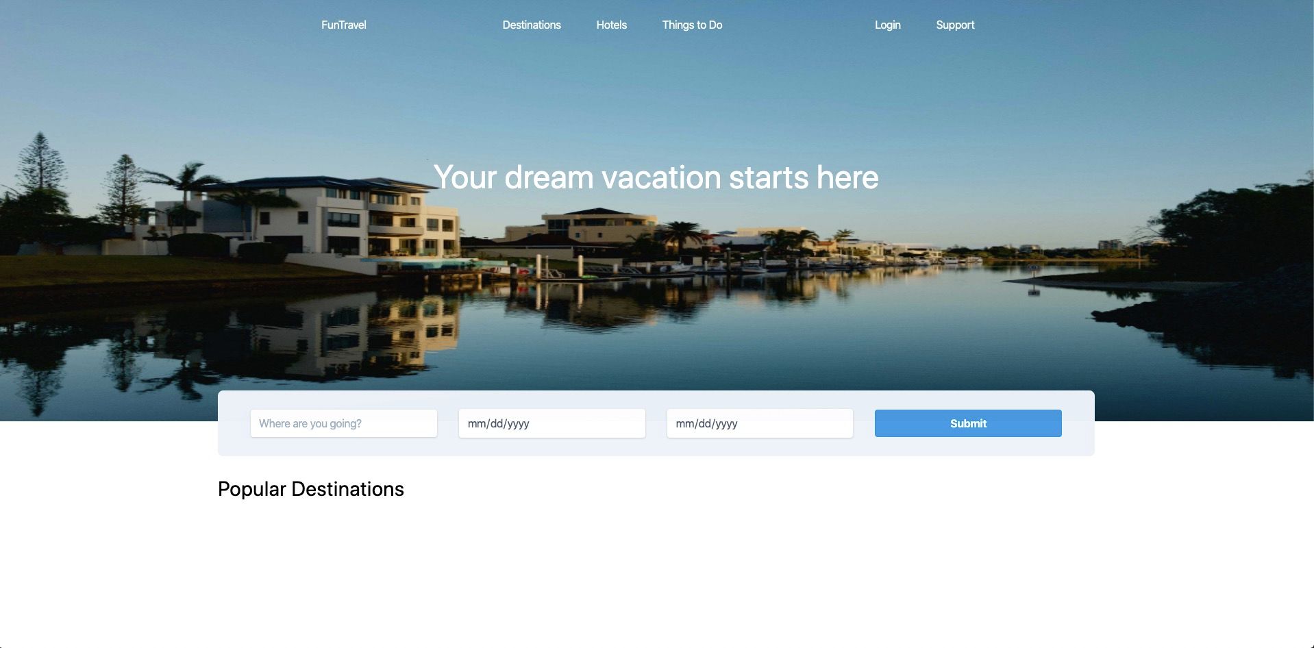
Within our new partial, we will create a new section and add our heading.
<section class="container mx-auto mt-6">
  <h2 class="text-3xl mb-6">Popular Destinations</h2>
</section>
Tailwind CSS classes:
| Class | Value |
|---|---|
| container | https://tailwindcss.com/docs/container/#app |
| mx-auto | margin-right: auto; margin-left: auto; |
| mt-6 | margin-top: 1.5rem; |
| text-3xl | font-size: 1.875rem; |
| mb-6 | margin: 1.5rem; |
Our site should now look like this:
Next, we will begin by adding our destination cards. First let's create a new folder in our src directory called cards. Then create a new file called italy.html within the src/cards directory. Then let's import it into our popular-destinations.html partial.
<section class="container mx-auto mt-6">
  <h2 class="text-3xl mb-6">Popular Destinations</h2>
  <include src="./cards/italy.html"></include>
</section>
The markup for our card.
<!-- src/cards/itay.hml -->
<div class="max-w-sm rounded overflow-hidden shadow-lg">
  <img class="w-full h-56" src="https://source.unsplash.com/600x400/?italy" />
</div>
Tailwind CSS classes:
| Class | Value |
|---|---|
| max-w-sm | max-width: 24rem; |
| rounded | border-radius: 0.25rem; |
| overflow-hidden | overflow: hidden; |
| shadow-lg | box-shadow: 0 10px 15px -3px rgba(0, 0, 0, 0.1), 0 4px 6px -2px rgba(0, 0, 0, 0.05); |
| w-full | width: 100%; |
| h-56 | height: 14rem; |
The card should look like this:
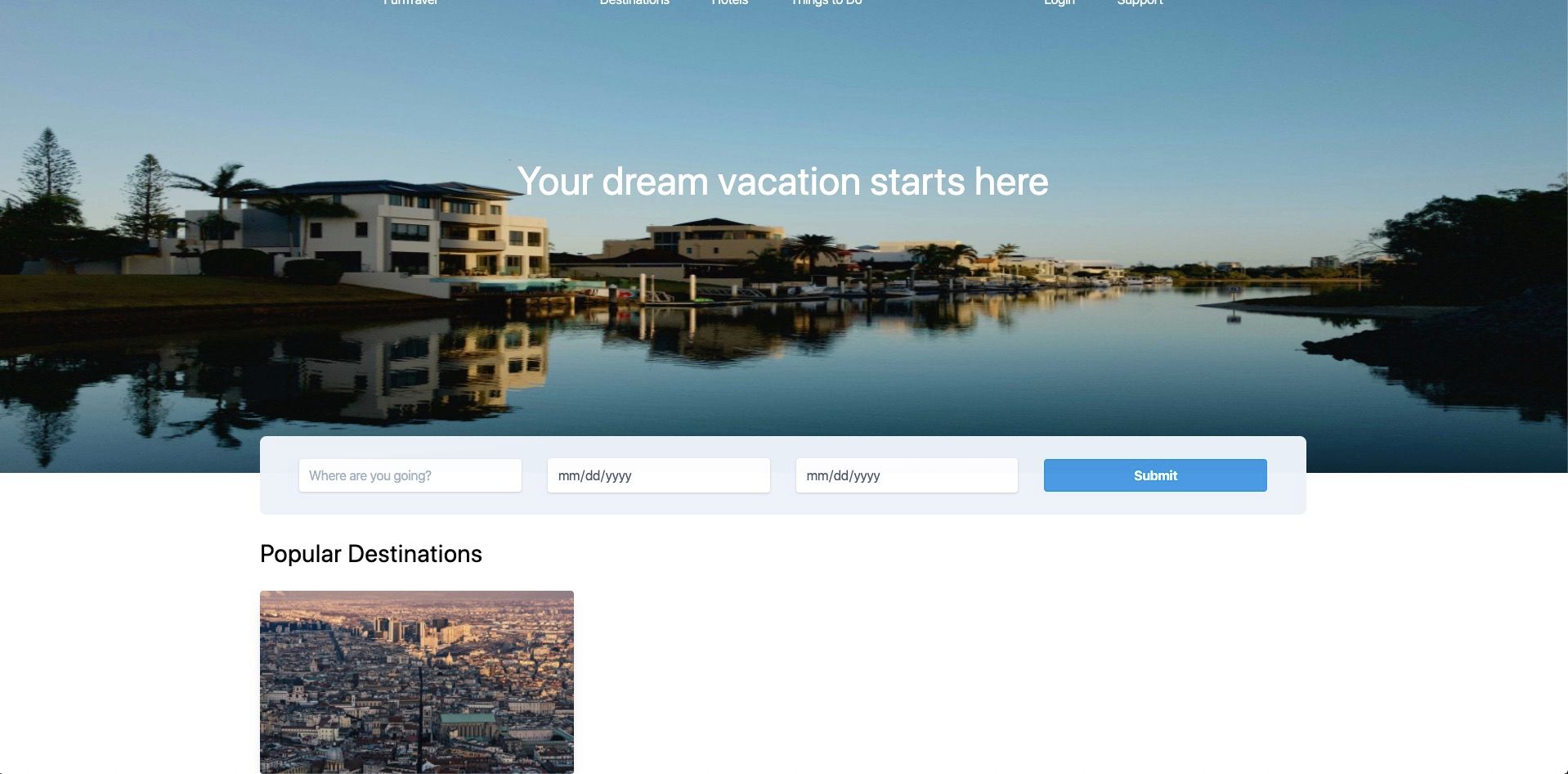
If you notice in the markup for the image src I am using a link to Unsplash which will dynamically load a new photo upon refresh, so your photo will most likely be different.
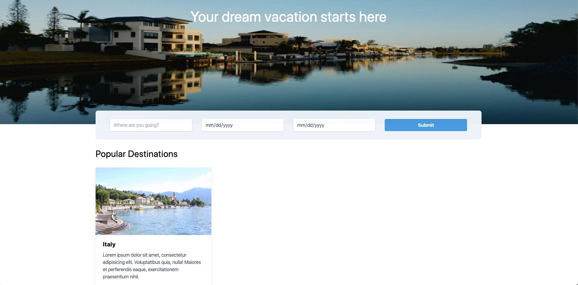
Now let's add in the cards content.
<div class="max-w-sm rounded overflow-hidden shadow-lg">
  <img class="w-full h-56" src="https://source.unsplash.com/600x400/?italy" />
  <div class="px-6 py-4">
    <div class="font-bold text-xl mb-2">Italy</div>
    <p class="text-gray-700 text-base">
      Lorem ipsum dolor sit amet, consectetur adipisicing elit. Voluptatibus
      quia, nulla! Maiores et perferendis eaque, exercitationem praesentium
      nihil.
    </p>
  </div>
</div>
Tailwind CSS classes:
| Class | Value |
|---|---|
| px-6 | padding-right: 1.5rem; padding-left: 1.5rem; |
| py-4 | padding-top: 1rem; padding-bottom: 1rem; |
| font-bold | font-weight: 700; |
| text-xl | font-size: 1.25rem; |
| mb-2 | margin-bottom: 0.25rem; |
| text-gray-700 | color: #4a5568; |
| text-base | font-size: 1rem; |
Our card with our new content should look like this:
Now let's add our button and our card will be complete
<div class="max-w-sm rounded overflow-hidden shadow-lg">
  <img class="w-full h-56" src="https://source.unsplash.com/600x400/?italy" />

  <div class="px-6 py-4">
    <div class="font-bold text-xl mb-2">Italy</div>
    <p class="text-gray-700 text-base">
      Lorem ipsum dolor sit amet, consectetur adipisicing elit. Voluptatibus
      quia, nulla! Maiores et perferendis eaque, exercitationem praesentium
      nihil.
    </p>
  </div>

  <div class="flex justify-end px-6 py-4">
    <button
      class="bg-transparent hover:bg-blue-500 text-blue-700 font-semibold hover:text-white py-2 px-4 border border-blue-500 hover:border-transparent rounded"
    >
      Get a Quote
    </button>
  </div>
</div>
Tailwind CSS classes:
| Class | Value |
|---|---|
| flex | display: flex; |
| justify-end | justify-content: flex-end; |
| px-6 | padding-right: 1.5rem; padding-left: 1.5rem; |
| py-4 | padding-top: 1rem; padding-bottom: 1rem; |
| bg-transparent | background-color: transparent; |
| hover:bg-blue-500 | hover:background-color: #4299e1; |
| text-blue-700 | color: #2b6cb0; |
| font-semibold | font-weight: 600; |
| hover:text-white | hover:color: #fff; |
| py-2 | padding-top: 0.5rem; padding-bottom: 0.5rem; |
| px-4 | padding-right: 1rem; padding-left: 1rem; |
| border border-blue-500 | border-color: #4299e1; |
| hover:border-transparent | hover:border-color: transparent; |
| rounded | border-radius: 0.25rem; |
Our finished card should now look like this:
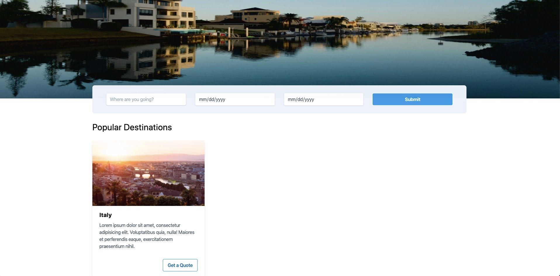
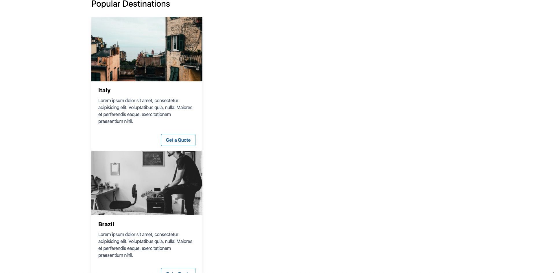
Now with our card complete, we simply need to duplicate our italy.html file and rename it to whatever destinations we like. I am going to create 2 new cards brazil.html and iceland.html and then include them inside of popular-destinations.html like so:
<section class="container mx-auto mt-6">
  <h2 class="text-3xl mb-6">Popular Destinations</h2>
  <include src="./cards/italy.html"></include>
  <include src="./cards/brazil.html"></include>
  <include src="./cards/iceland.html"></include>
</section>
Now all we need to do is modify the title and the Unsplash image for each new card.
<!-- brazil.html -->
<div class="max-w-sm rounded overflow-hidden shadow-lg">
  <img class="w-full h-56" src="https://source.unsplash.com/600x400/?brazil" />

  <div class="px-6 py-4">
    <div class="font-bold text-xl mb-2">Brazil</div>
    <p class="text-gray-700 text-base">
      Lorem ipsum dolor sit amet, consectetur adipisicing elit. Voluptatibus
      quia, nulla! Maiores et perferendis eaque, exercitationem praesentium
      nihil.
    </p>
  </div>

  <div class="flex justify-end px-6 py-4">
    <button
      class="bg-transparent hover:bg-blue-500 text-blue-700 font-semibold hover:text-white py-2 px-4 border border-blue-500 hover:border-transparent rounded"
    >
      Get a Quote
    </button>
  </div>
</div>
<!-- iceland.html -->
<div class="max-w-sm rounded overflow-hidden shadow-lg">
  <img class="w-full h-56" src="https://source.unsplash.com/600x400/?iceland" />

  <div class="px-6 py-4">
    <div class="font-bold text-xl mb-2">Iceland</div>
    <p class="text-gray-700 text-base">
      Lorem ipsum dolor sit amet, consectetur adipisicing elit. Voluptatibus
      quia, nulla! Maiores et perferendis eaque, exercitationem praesentium
      nihil.
    </p>
  </div>

  <div class="flex justify-end px-6 py-4">
    <button
      class="bg-transparent hover:bg-blue-500 text-blue-700 font-semibold hover:text-white py-2 px-4 border border-blue-500 hover:border-transparent rounded"
    >
      Get a Quote
    </button>
  </div>
</div>
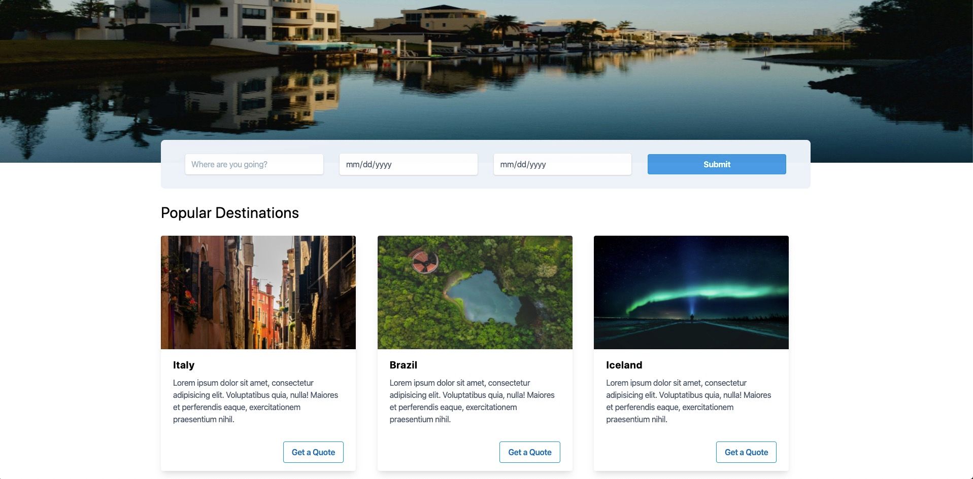
Next we need to put our cards in a single row and a 3-column grid. We can do this very easily with Tailwind CSS flexbox classes.
We just need to add our new grid to popular-destinations.html like so:
<section class="container mx-auto mt-6">
  <h2 class="text-3xl mb-6">Popular Destinations</h2>

  <div class="flex mb-4">
    <div class="w-1/3">
      <include src="./cards/italy.html"></include>
    </div>
    <div class="w-1/3">
      <include src="./cards/brazil.html"></include>
    </div>
    <div class="w-1/3">
      <include src="./cards/iceland.html"></include>
    </div>
  </div>
</section>
Now our popular destinations section should look like this:
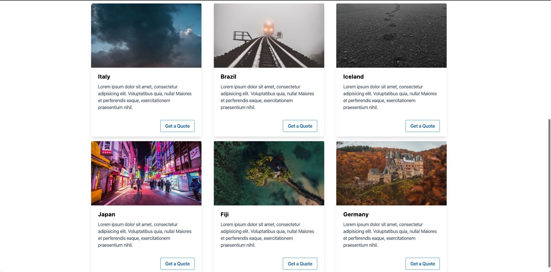
Let's make 3 more cards and create another row so we have a total of 6 popular destinations. Duplicate one of your cards, with a new name for each destination. I am going to create japan.html``fiji.html & germany.html
Now all we need to do is duplicate our grid and include our new files.
<section class="container mx-auto mt-6">
  <h2 class="text-3xl mb-6">Popular Destinations</h2>

  <div class="flex mb-4">
    <div class="w-1/3">
      <include src="./cards/italy.html"></include>
    </div>
    <div class="w-1/3">
      <include src="./cards/brazil.html"></include>
    </div>
    <div class="w-1/3">
      <include src="./cards/iceland.html"></include>
    </div>
  </div>

  <div class="flex mb-4">
    <div class="w-1/3">
      <include src="./cards/japan.html"></include>
    </div>
    <div class="w-1/3">
      <include src="./cards/fiji.html"></include>
    </div>
    <div class="w-1/3">
      <include src="./cards/germany.html"></include>
    </div>
  </div>
</section>
That's it! Now our popular destinations sections is complete 😏
You can download a copy of the completed tutorial from the repo here. Each section of the tutorial is within its own branch. The branch for this article is 4-popular-destinations
Or you can do it via git with:
git clone git@github.com:robertguss/howtocode.io-tailwind-css-landing-page.git

git checkout 4-popular-destinations