Tailwind CSS
Tailwind CSS Travel Site - 5. Features Section
Updated:
In this lesson, we are going to be building the popular destinations section of our travel site.
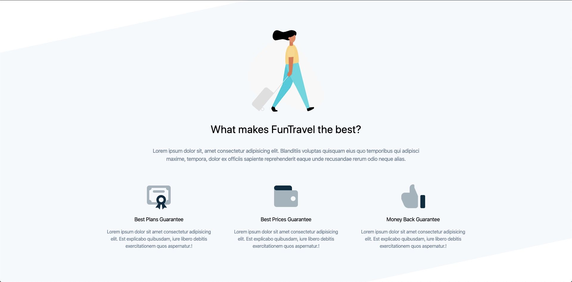
The final result will look like:
You can pick up where we last left off, by cloning the previous tutorial's branch with git.
git clone git@github.com:robertguss/howtocode.io-tailwind-css-landing-page.git

git checkout 4-popular-destinations
This branch also contains images and svg's that we will use in this section, so please make sure you grab those.
At this point in our tutorial, you should be getting quite familiar with how the classes in Tailwind CSS work and what they mean. So for the rest of the tutorials, I will not be creating tables which list what each class means. If you come across a class you do not recognize, please use the search in their docs to look it up.
First, let's create our new partial features.html and add it to our src/partials directory. Then include it in index.html
<!DOCTYPE html>
<html lang="en">
  <head>
    <meta charset="UTF-8" />
    <meta name="viewport" content="width=device-width, initial-scale=1.0" />
    <title>Home | FunTravel</title>
    <link rel="stylesheet" href="./css/main.css" />
  </head>

  <body>
    <include src="./partials/nav.html"></include>
    <include src="./partials/hero.html"></include>
    <include src="./partials/quote-form.html"></include>
    <include src="./partials/popular-destinations.html"></include>
    <include src="./partials/features.html"></include>

    <script src="./js/main.js"></script>
  </body>
</html>
Next, we will add the illustration image and our headings inside of features.html
<section class="better-to-buy relative mt-48">
<div class="carry-on-illustration pt-32">
<img class="w-64 mx-auto" src="./images/carry-on-colour.svg" alt="" />
</div>
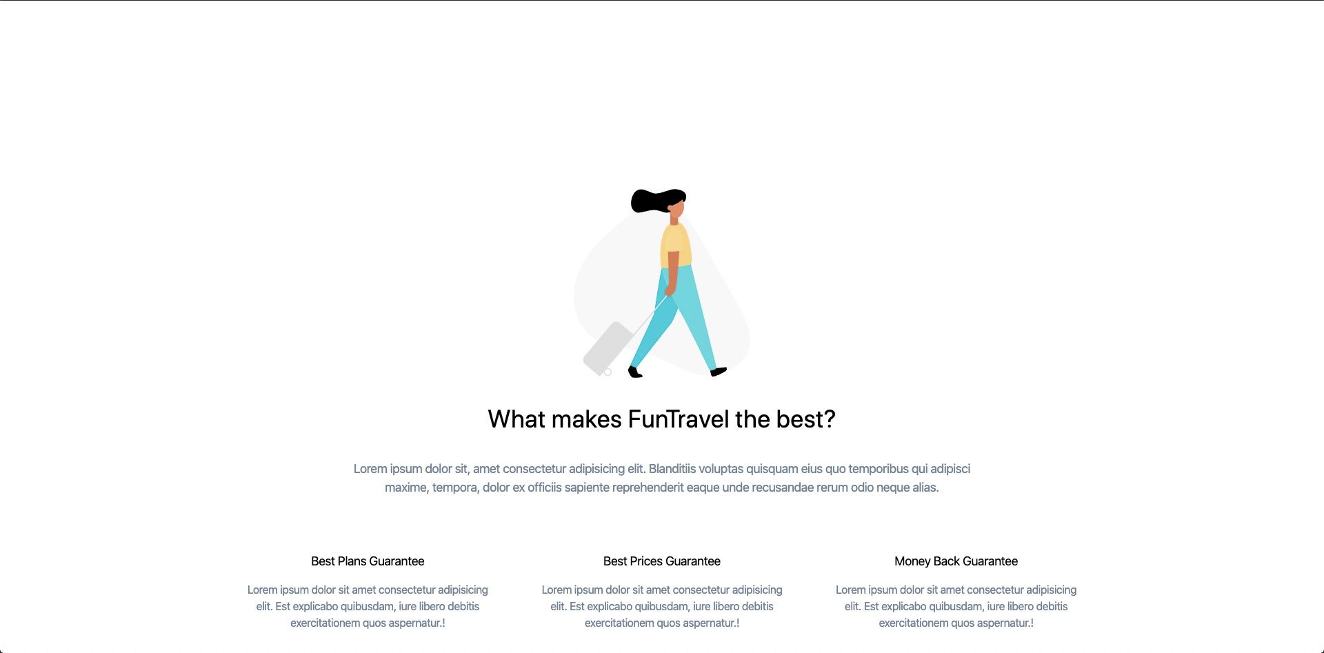
<h2 class="text-center text-4xl mt-8">What makes FunTravel the best?</h2>
<p class="text-center text-lg text-gray-600 mt-8 w-1/2 mx-auto">
Lorem ipsum dolor sit, amet consectetur adipisicing elit. Blanditiis
voluptas quisquam eius quo temporibus qui adipisci maxime, tempora, dolor ex
officiis sapiente reprehenderit eaque unde recusandae rerum odio neque
alias.
</p>
</section>
Our features section should now look like this:
Just a reminder that if you are wondering where you can find this particular image/svg of the woman walking with her suitcase, it is located in the GitHub repo listed above under branch 4-popular-destinations
- These illustrations come from Drawkit.io
Next, we will add the 3 features.
<section class="better-to-buy relative mt-48">
  <div class="carry-on-illustration pt-32">
    <img class="w-64 mx-auto" src="./images/carry-on-colour.svg" alt="" />
  </div>

  <h2 class="text-center text-4xl mt-8">What makes FunTravel the best?</h2>

  <p class="text-center text-lg text-gray-600 mt-8 w-1/2 mx-auto">
    Lorem ipsum dolor sit, amet consectetur adipisicing elit. Blanditiis
    voluptas quisquam eius quo temporibus qui adipisci maxime, tempora, dolor ex
    officiis sapiente reprehenderit eaque unde recusandae rerum odio neque
    alias.
  </p>

  <div class="flex mt-8 container mx-auto">
    <!-- Best Plans Guarantee -->
    <div class="w-1/3 p-8">
      <h3 class="text-lg text-center my-4">Best Plans Guarantee</h3>
      <p class="text-center text-gray-600">
        Lorem ipsum dolor sit amet consectetur adipisicing elit. Est explicabo
        quibusdam, iure libero debitis exercitationem quos aspernatur.!
      </p>
    </div>

    <!-- Best Prices Guarantee -->
    <div class="w-1/3 p-8">
      <h3 class="text-lg text-center my-4">Best Prices Guarantee</h3>
      <p class="text-center text-gray-600">
        Lorem ipsum dolor sit amet consectetur adipisicing elit. Est explicabo
        quibusdam, iure libero debitis exercitationem quos aspernatur.!
      </p>
    </div>

    <!-- Money Back Guarantee -->
    <div class="w-1/3 p-8">
      <h3 class="text-lg text-center my-4">Money Back Guarantee</h3>
      <p class="text-center text-gray-600">
        Lorem ipsum dolor sit amet consectetur adipisicing elit. Est explicabo
        quibusdam, iure libero debitis exercitationem quos aspernatur.!
      </p>
    </div>
  </div>
</section>
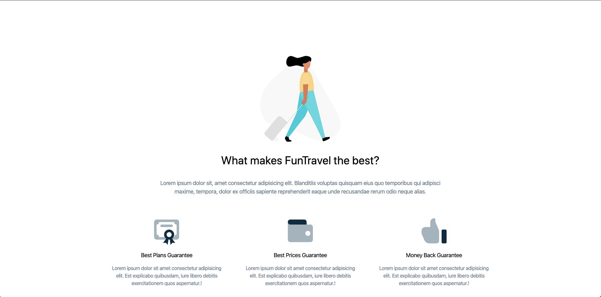
Our features sections now looks like:
Let's add some nice icons above each feature to make this section look better.
Icon 1:
<svg
  xmlns="http://www.w3.org/2000/svg"
  viewBox="0 0 24 24"
  class="w-24 mx-auto"
>
  <path
    style="fill: #A5B3BB;"
    d="M4 3h16a2 2 0 0 1 2 2v12a2 2 0 0 1-2 2H4a2 2 0 0 1-2-2V5c0-1.1.9-2 2-2zm16 12V7a2 2 0 0 1-2-2H6a2 2 0 0 1-2 2v8a2 2 0 0 1 2 2h12c0-1.1.9-2 2-2zM8 7h8a1 1 0 0 1 0 2H8a1 1 0 1 1 0-2z"
  ></path>
  <path
    style="fill: #0D2B3E;"
    d="M11.65 18.23a4 4 0 1 1 4.7 0l2.5 3.44-2.23-.18-1.48 1.68-.59-4.2a4.04 4.04 0 0 1-1.1 0l-.6 4.2-1.47-1.68-2.23.18 2.5-3.44zM14 17a2 2 0 1 0 0-4 2 2 0 0 0 0 4z"
  ></path>
</svg>
Icon 2:
<svg
  xmlns="http://www.w3.org/2000/svg"
  viewBox="0 0 24 24"
  class="w-24 mx-auto"
>
  <path
    style="fill: #A5B3BB;"
    d="M2 5c0 1.1.9 2 2 2h16a2 2 0 0 1 2 2v10a2 2 0 0 1-2 2H4a2 2 0 0 1-2-2V5zm16 11a2 2 0 1 0 0-4 2 2 0 0 0 0 4z"
  ></path>
  <path
    style="fill: #0D2B3E;"
    d="M4 3h11a2 2 0 0 1 2 2v2H4a2 2 0 1 1 0-4z"
  ></path>
</svg>
Icon 3:
<svg
  xmlns="http://www.w3.org/2000/svg"
  viewBox="0 0 24 24"
  class="w-24 mx-auto"
>
  <path
    style="fill: #A5B3BB;"
    d="M13 4.8l2.92 6.8a1 1 0 0 1 .08.4v8a2 2 0 0 1-2 2H8a4.28 4.28 0 0 1-3.7-2.45L2.07 14.4A1 1 0 0 1 2 14v-2a3 3 0 0 1 3-3h4V5a3 3 0 0 1 3-3 1 1 0 0 1 1 1v1.8z"
  ></path>
  <rect
    width="4"
    height="11"
    x="18"
    y="11"
    style="fill: #0D2B3E;"
    rx="1"
  ></rect>
</svg>
Finished markup with icons added:
<section class="better-to-buy relative mt-48">
  <div class="carry-on-illustration pt-32">
    <img class="w-64 mx-auto" src="./images/carry-on-colour.svg" alt="" />
  </div>

  <h2 class="text-center text-4xl mt-8">What makes FunTravel the best?</h2>

  <p class="text-center text-lg text-gray-600 mt-8 w-1/2 mx-auto">
    Lorem ipsum dolor sit, amet consectetur adipisicing elit. Blanditiis
    voluptas quisquam eius quo temporibus qui adipisci maxime, tempora, dolor ex
    officiis sapiente reprehenderit eaque unde recusandae rerum odio neque
    alias.
  </p>

  <div class="flex mt-8 container mx-auto">
    <!-- Best Plans Guarantee -->
    <div class="w-1/3 p-8">
      <svg
        xmlns="http://www.w3.org/2000/svg"
        viewBox="0 0 24 24"
        class="w-24 mx-auto"
      >
        <path
          style="fill: #A5B3BB;"
          d="M4 3h16a2 2 0 0 1 2 2v12a2 2 0 0 1-2 2H4a2 2 0 0 1-2-2V5c0-1.1.9-2 2-2zm16 12V7a2 2 0 0 1-2-2H6a2 2 0 0 1-2 2v8a2 2 0 0 1 2 2h12c0-1.1.9-2 2-2zM8 7h8a1 1 0 0 1 0 2H8a1 1 0 1 1 0-2z"
        ></path>
        <path
          style="fill: #0D2B3E;"
          d="M11.65 18.23a4 4 0 1 1 4.7 0l2.5 3.44-2.23-.18-1.48 1.68-.59-4.2a4.04 4.04 0 0 1-1.1 0l-.6 4.2-1.47-1.68-2.23.18 2.5-3.44zM14 17a2 2 0 1 0 0-4 2 2 0 0 0 0 4z"
        ></path>
      </svg>
      <h3 class="text-lg text-center my-4">Best Plans Guarantee</h3>
      <p class="text-center text-gray-600">
        Lorem ipsum dolor sit amet consectetur adipisicing elit. Est explicabo
        quibusdam, iure libero debitis exercitationem quos aspernatur.!
      </p>
    </div>

    <!-- Best Prices Guarantee -->
    <div class="w-1/3 p-8">
      <svg
        xmlns="http://www.w3.org/2000/svg"
        viewBox="0 0 24 24"
        class="w-24 mx-auto"
      >
        <path
          style="fill: #A5B3BB;"
          d="M2 5c0 1.1.9 2 2 2h16a2 2 0 0 1 2 2v10a2 2 0 0 1-2 2H4a2 2 0 0 1-2-2V5zm16 11a2 2 0 1 0 0-4 2 2 0 0 0 0 4z"
        ></path>
        <path
          style="fill: #0D2B3E;"
          d="M4 3h11a2 2 0 0 1 2 2v2H4a2 2 0 1 1 0-4z"
        ></path>
      </svg>
      <h3 class="text-lg text-center my-4">Best Prices Guarantee</h3>
      <p class="text-center text-gray-600">
        Lorem ipsum dolor sit amet consectetur adipisicing elit. Est explicabo
        quibusdam, iure libero debitis exercitationem quos aspernatur.!
      </p>
    </div>

    <!-- Money Back Guarantee -->
    <div class="w-1/3 p-8">
      <svg
        xmlns="http://www.w3.org/2000/svg"
        viewBox="0 0 24 24"
        class="w-24 mx-auto"
      >
        <path
          style="fill: #A5B3BB;"
          d="M13 4.8l2.92 6.8a1 1 0 0 1 .08.4v8a2 2 0 0 1-2 2H8a4.28 4.28 0 0 1-3.7-2.45L2.07 14.4A1 1 0 0 1 2 14v-2a3 3 0 0 1 3-3h4V5a3 3 0 0 1 3-3 1 1 0 0 1 1 1v1.8z"
        ></path>
        <rect
          width="4"
          height="11"
          x="18"
          y="11"
          style="fill: #0D2B3E;"
          rx="1"
        ></rect>
      </svg>
      <h3 class="text-lg text-center my-4">Money Back Guarantee</h3>
      <p class="text-center text-gray-600">
        Lorem ipsum dolor sit amet consectetur adipisicing elit. Est explicabo
        quibusdam, iure libero debitis exercitationem quos aspernatur.!
      </p>
    </div>
  </div>
</section>
Our features section should now look like:
We can even get a little fancier with some custom CSS by adding a cool diagonal background color. Add the following css to main.css
.better-to-buy:before {
  content: "";
  position: absolute;
  z-index: -1;
  width: 100%;
  height: 115%;
  top: 0;
  -webkit-transform: skewY(-12deg);
  transform: skewY(-12deg);
  background: #f6f9fc;
}
Now this features section has a little more style, design and "pop."
That's it! Now our features sections is complete 🔥
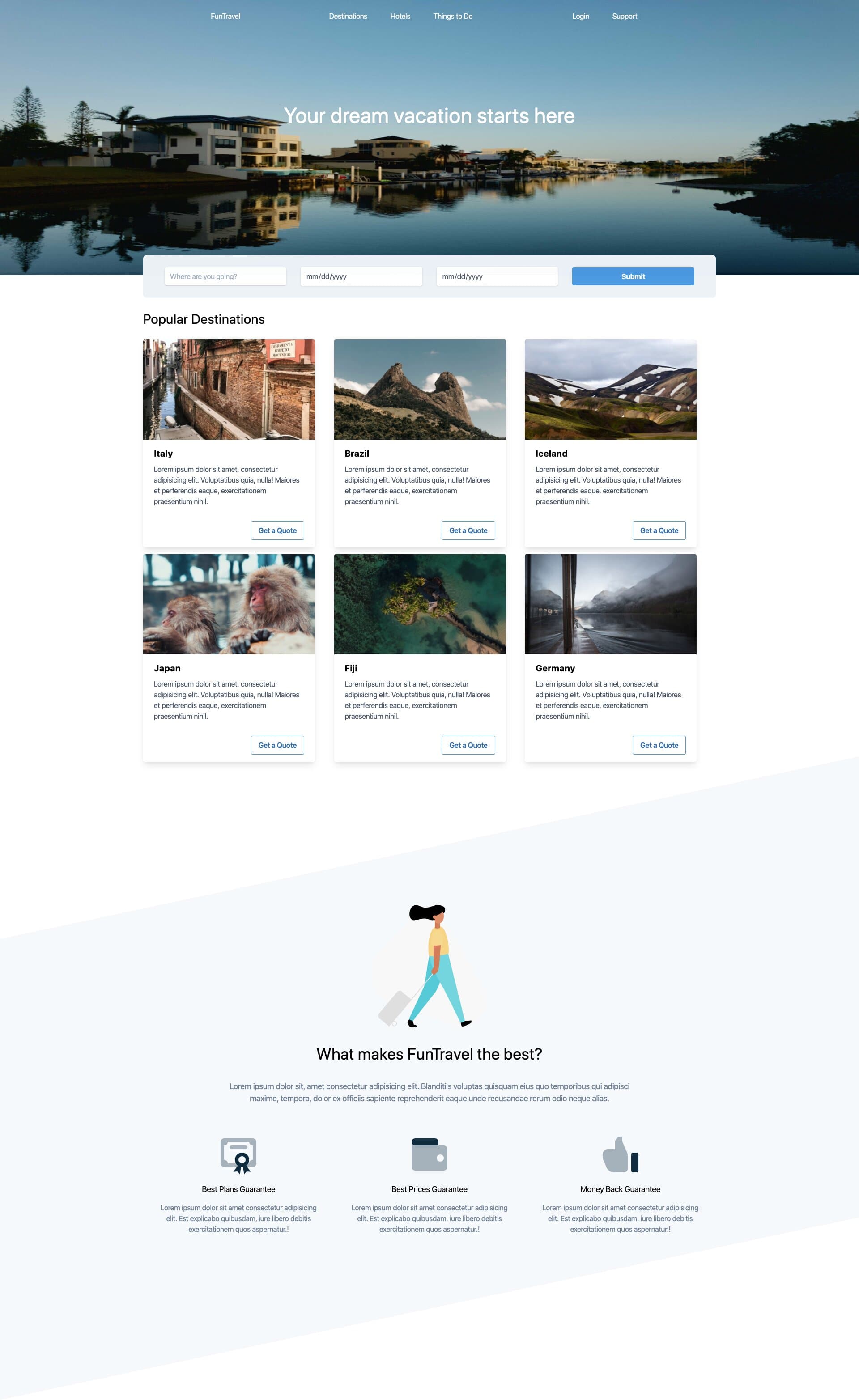
Our travel site so far looks like:
You can download a copy of the completed tutorial from the repo here. Each section of the tutorial is within its own branch. The branch for this article is 1-installing-tailwind-css
Or you can do it via git with:
git clone git@github.com:robertguss/howtocode.io-tailwind-css-landing-page.git

git checkout 5-features-section